
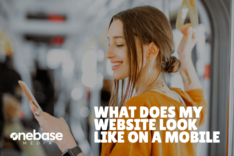
When building a website for your business, it can be easy to only focus on what your website looks like on a computer screen and forget that people will be using other devices such as tablets and mobiles.
If your website does not work well on other devices then this is not going to give customers a good impression of your company.
Here are a few rules to follow when you are first designing your website:
User Friendly
Above all else, the most important thing for a website is to ensure that it is user-friendly. If your website is difficult for your customers to use especially on other devices such as mobiles, then what is the point in even having it? You need to be honest with yourself and decide whether you would waste your time on a website which you struggle to use.
Easy to Navigate
Don’t take your customers on the long, boring and seemingly endless journey of having to constantly search through many, many pages to get the information that they are after – despite what you might think, no, this is not a way to keep them on your website for longer. No, this is a way to frustrate your (what was) potential customer and get them to leave your website, where they will then head over to an easier, customer orientated and mobile friendly website.
Website navigation is highly important, which is why it is always important to take your website for a test run and see how easy it is to use.
Professional Design
When having a website which is selling products or services to customers, it is important to have a professional web design to show that you take your job seriously and that you are a trustworthy company.
Make sure that the theme of your company is spread throughout all of the pages, while spreading the information evenly throughout the website, rather than bombarding the customer with information all at once on the first page.
Colours and content are also important factors to consider: If you had a funeral company you wouldn’t have bright lively colours on your web pages with clip art pictures, you would need to create a professional atmosphere by using neutral plain colours and photos of your employees and past services you have helped at.
Now let’s focus on viewing and improving your website on mobiles:
How Does It Work?
When you have viewed websites on your mobile in the past, have you ever been shocked at how terrible a website looks and wonder how the owner could just leave their website so terribly unusable for any of their users?
That is what you need to consider when you are converting your website to mobile and taking the time to look through it all.
A good way to improve your website if you are not happy with the way it is looking on your phone, is to make a list of changes that could be made. No matter how small or silly they might sound, all improvements will contribute to make your website easier for everyone to use. Be harsh and honest with yourself as you need your website to be the best it can possibly be especially with many other companies out there competing against you.
Navigation Buttons
Having long navigation panels for your website on a mobile can take up a lot of space, which is why I would suggest for you to change the way clients navigate their way around your website.
Drop down navigation can work extremely well since it is tucked out of the way and it is simple to use.
While you are at it, make sure that all of your navigation buttons are clearly labelled and that all of the information on the pages is clearly organised, so there are no problems of constantly going in and out of pages to find what you are looking for.
Make It Fun
Take advantage of the benefits of having mobile visitors and of the different apps on their phone.
Snapchat
If your company has a Snapchat account, then post your code online for them to follow.
QR Codes
This is an amazing piece of technology which makes accessing information and social media pages even more fun for mobile phone users. And it’s not just for fun! Whether you’re launching a new app or want to send customers straight to your website, easily generate your own QR codes with user-friendly online QR code generator tools. No coding required! Share them on packaging, posters, or even your social media bio, and watch customers engage instantly.
By incorporating advanced QR code solutions, you can effortlessly guide users to key web pages, promotional material, or enticing content—all with a simple scan. These tools empower you to build stronger connections with your audience, enhancing engagement and making interactions seamless.
Easy Contact
The main purpose of people having a mobile is so they can call people, so take advantage of this and put your contact number and email address on your website so that with a simple click, people can call you with their questions or quickly send you an email.
Website Content
Although online, the more content you have the better it is, when you are on a mobile, it can be hard reading through endless amounts of content, which is why sometimes it can be useful to cut it down and change the content layout.
When I say content, this could be taking out a few photos or videos, minimising the amount of stuff on your website page, for instance customer ratings and comments, or random bits of extra text that doesn’t necessarily need to be there.
People on their phones just want to get straight to the point when trying to find information, so don’t make them spend longer than necessary trying to find it. Your content layout should be neat and easy to go through. If not, your customers could potentially move on to another website.
Text Layout
While on a website, multiple columns can work, but when it comes to the mobile layout of websites, single columns always work best. Don’t make the poor customer constantly have to adjust their screen to read across sentences, they shouldn’t have to put in any effort to view your website, so don’t make them.
The Simpler The Better
Don’t worry about making your mobile’s website too extravagant, follow the rule that the simpler your website is, the better.
While it is still important to have your website looking smart and interesting, don’t over do it with the pictures and the endless amounts of text, your customers won’t appreciate having to scroll past endless amounts of stuff that is not relevant to your website, or that they simply do not care about.
Provide For The User
When you are designing your website, you need to bear in mind the reasons why people are accessing your website on their phone:
- Speed: To quickly access the information they need.
- Ease: Maybe they don’t have any other devices, or at the time it was the easiest option.
- Boredom: We have all gone internet surfing when we are bored, so this may be what the customer is doing. This is why it is important for you to keep your website interesting.
Chuck a few pictures and videos – maybe even a photo gallery and video gallery page – on your website to keep the users entertained and provide them with interesting pieces of content for them to read.
Work out what you would want to see on your website if you came across it when internet browsing.