
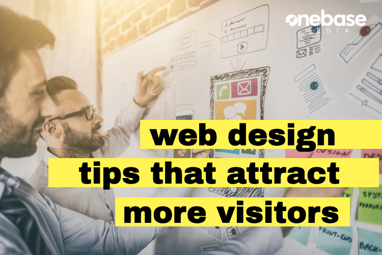
In the past, it was your business suit and presentation that caught the eyes of prospects. Today, it’s all about your website design and functionality. If you don’t have an online presence, then you’re giving money away to your competition.
If you don’t already have a website, then it’s time to build one and fast (check MyBestWebsiteBuilder.com for detailed steps). And if you already have a site built, then it’s important to ensure the design is user-oriented.
With the right design tips, you can ensure your website will attract your audience and potentially convert them.
In the following guide, we’ll cover some of these tips so you can ensure your site performs well for your brand.
Let’s begin!
Give Your Pages a Visual Hierarchy
What is a visual hierarchy? In a nutshell, it’s the arrangement of colour, size, and contrast of all the visual elements on your website. The purpose is to identify their relative prominence, as well as the order they’re seen by your visitors.
Professional web designers use design tips like this to help guide the attention of visitors. The idea is to make visitors see the more important elements first. This consists of the layout – where everything is positioned on the page, the size, the type of visuals and the colour schemes.
Here’s a quick break down: The size of visuals has more prominence the larger it is. The position of the elements on your website are more prominent the higher they are on the page. Then, the format is more noticeable for video and moving images than it is for still images and text.
Last, the position of other elements should be surrounded by white space to capture attention versus being crowded on the page.
The idea is to go with high visual prominence elements to make your website design easier on the eye and more enjoyable for visitors.
Every Headline Should Be Descriptive and Optimized
There are two major functions of a headline when it comes to digital marketing and design tips. One, it helps tell the visitor what the page is about. And two, you can optimize it for search engines. Search engine bots crawl headings to see what a page is about so don’t overlook using keywords.
Make sure each page has a headline high on the page that’s keyword-focused and descriptive.
If this is the homepage, then information about your company and what it does should be high up on the page after the headline.
What About the Fold?
If you’ve been in web design for some time, you likely hear a lot of design tips about placing things above the fold. The fold is nothing more than the section of the page you can see before having to scroll down.
This is a crucial area for getting as much important information in, along with your call to action. Today, users are on mobile and desktop devices, which can alter where the fold begins.
Make sure to test on multiple devices to ensure the info you want to be displayed above the fold is showing.
Ensure the Design Supports Quick Loading Speed
Some businesses get carried away following all of the best design tips and end up adding tons of elements to their web design. You’ll learn quickly that adding one too many images, moving graphics and flash will slow download times significantly.
And in turn, slow load times will hurt your traffic numbers by increasing your bounce rates. When this goes on for too long, it will notify search engine bots and they will reduce your ranking in the search engine results pages (SERPs).
You can use free tools online that can measure your page load speeds. If it’s not under three seconds, then it’s time to lighten the load.
Have Intuitive Navigation
When visitors first come to your website, they shouldn’t have to search all around for the pages they want. It’s up to you to make a design that’s intuitive enough for newcomers to navigate through your site.
One of our design tips is that you should follow the standards of design based on your industry. For instance, if you have an e-commerce website, then you should have a shopping cart or bag at the top right corner.
It’s alright to be unique, but not in ways that will make it confusing for your visitors. Keep layouts similar, but the overall colours and elements different.
Also, minimize the number of links you have on your site. This way, visitors won’t have to scroll through long menus to find what they’re looking for. You can have subcategories if necessary.
Include Social Media Buttons
Not only will social media buttons help site visitors find and follow your pages, but it’ll help them share your content as well. You have to think that each visitor to your site is new and doesn’t know about your other platforms.
Another one of our design tips? Adding social buttons at the bottom of each page is an ideal way to direct traffic to brand profiles. Also, it’s a good idea to include social media share buttons at the bottom of each blog post so that readers can share your posts.
It’s very important that you include your web development in your social media marketing efforts.
Ensure You Have a Responsive Design
Now, here’s one of our design tips you don’t want to ignore. It’s important to have a site design that’s accessible to users no matter the device they’re on. In the past, the only way to pull this off was to create two separate sites – one for mobile and one for desktop users.
Thankfully, that migraine is long gone and all you have to do today is build your site with a responsive design. And just as it sounds, it will respond to the device accessing the site. The screen size and functions will shift based on whether it’s a smartphone or desktop.
This is cheaper on your part and less to manage since there’s only one website to take care of.
Keep Your Site Free of Errors
There’s nothing more annoying than clicking on a link to a page you really wanted to visit only to see an error message. No one wants to deal with a site with missing and malfunctioning pages.
Eliminating these issues is of critical importance in our list of design tips. Make sure to deal with them spot on so you don’t lose a ton of traffic. There are page checking tools you can use to go through all the pages on your site to find these error pages.
Once you find them, you’ll need to put the correct link or fix the error. And if you can’t do this, then pull down the page and hire an expert for help.
Include Calls to Action Throughout Your Site
So far in our design tips, we’ve already talked about placing important info and calls to action above the fold of your pages. However, this isn’t the only place you should put them. It’s essential to have calls to action strategically placed throughout each page.
Particularly, you want CTAs in the top, middle, and end of each page. This way, you’re drilling the visitors with what to do next without overwhelming them.
Placing a CTA at the top of the page will convert those who already know what they want and are ready to act now. And a CTA at the bottom will be for those who now have a better understanding of what you offer and need an action to perform next.
It’s a strategy you see used in landing pages all the time – and it really works. Now, it’s important to note that a lot of engagement happens below the fold so don’t put all your eggs above the fold. Spread it out.
Go with Tall Pages vs. Multiple Pages
Thanks to tablets and smartphones, we now expect each site to have endless scrolling capabilities. And because of this, next on our list of design tips is the notion that it’s better to design your pages tall instead of requiring users to click next over and over.
What’s also helpful about this is that it allows users to digest everything in one go. They can easily revert back to the info you mentioned earlier without having to look through each page to find it.
Plus, it’s better that you include all the answers to your visitors’ questions on one page. Then there’s a higher chance user will stick around to read through the page, since there’s no interruption in between pages.
Remember, the attention span of today’s consumers is much shorter than in the past. And with that, we move on to the next of our design tips.
Only Show One Thing at a Time
Since the attention span of consumers is diminishing, it’s ideal to only show one thing at a time on your pages. Now, this doesn’t mean you have to make a separate page for each service or product.
It just means you have to include lots of white space and separation from one thing to the next. Refrain from cluttering your pages so it doesn’t appear chaotic and disorganized.
This is also why you’ll see trending websites with single column layouts and long pages. Having multiple columns is complex and cluttered.
The idea behind this part of our design tips is to have no more than one or two elements for visitors to focus on per scroll depth.
Stick to Prototypical Web Designs
Now, we touched on this little earlier but let’s elaborate on it a little more. Again, you want a unique design, but not when it comes to the layout. Instead, focus on saying something different and using different content types to do it (video, images, infographics, etc.).
So what’s prototypical about website layouts? Ideally, you want the following layout on your site:
- Logo on the top left
- Contact info on the top right
- Header main navigation
- CTA up high and visible
- Value proposition high on the page
- Slideshow on the homepage
- Email signup in the header
- Social media buttons in the footer
- Responsive design
Obviously, you don’t have to have all of these elements. But if you do have them, consider placing them in these areas of the layout.
Think Twice About Carousels and Rotating Sliders
For a while, carousels and sliders were quite popular on websites. However, chances are, visitors are only going to see the first slide.
Then calls to action will go ignored as well. One way around this is to stack the slides instead. This way, visitors are able to see them as they scroll down the page.
Another option is to use a featured image for your slider. This image should be the most impactful in case visitors don’t see past that one slider.
Include Images of People
Faces are very powerful imagery and can help to build trust with your brand. Adding this to your web design is a key way to grab attention and instil positive emotions.
For instance, showing a family enjoying a picnic or a mother and children with their pet dog. Cats and dogs are a close second when it comes to optimistic visuals for web design.
Having images of people is a great way to populate a page and make it feel more human at the same time.
On that note, it’s also important to remember that stock photos are a no-go. This is too plastic and unauthentic and will only rub visitors the wrong way. Most companies consider buying stock photos because they’re high-quality.
But in this case, it’s better to have authenticity than polish.
Packaging these Design Tips into a Strategy
Your next step is to begin implementing the design tips mentioned above. It’s a good idea to test out different ways to improve your design to see what works for you and your audience.
If you’re not already using it, integrate Google Analytics with your site so that you can track all traffic and engagement.
Then if you need expert assistance with your web development and digital marketing, you can enlist the services of One Base Media. We have a team of professionals that can help you with your web design, marketing, graphic design and even print marketing collateral.
Contact us now to see how we can help your website and brand succeed.
Speak to an expert
Got a quick question about your marketing? Or you want to run through the details of your next big project. We can help.
Speak to one of our experts today on 01702 668207 or send us a message.