Are you looking for inspiration for your garden landscaping website? Check out these 12 unique designs!
These websites have been designed with garden landscaping in mind, and they will surely give you some ideas for your website. There is something here for everyone, from simple to more complex designs.
So browse through these websites and get inspired to create your own beautiful and functional garden landscaping website!
Why should you have a website for your landscaping company?
A website is a great way to showcase your work, attract new customers, and grow your landscaping company. A website will give you an edge over your competition and help you build a solid online presence.
Your website can include photos of your previous work, testimonials from satisfied customers, and information about your services.
Potential customers can visit your website to learn more about what you do, and they can contact you quickly to get a quote or book an appointment.
A well-designed website will help you stand out from the crowd and attract new business. So, having a website is essential if you’re serious about growing your landscaping business.
Landscaping website optimisation, what’s involved
Once you’ve decided to create a web designer for your landscaping business, optimising it for search engines is essential. This will help potential customers find your website easily when searching for landscaping services online.
Here are a few things the best landscaping websites do to optimise for search engines:
Keywords: Use keywords in your content so that your own website comes up when people are searching for those keywords. Use keyword tools like UberSuggest to find highly searched keywords in your local area.
Alt tagging: Alt tag the images of your work with what the image is about. Here is a video on alt tagging images – [Alt tagging tutorial]
Local location pages: Have location pages for the different towns you cover, for example, www.landscapingbusiness.com/landscapers-chelsea/
Page titles: Use page titles that include your leading service and the location you would like your business to show up. Including your service and area will help Google rank you higher. The page title is the strapline the user sees before they click through to your website on Google.
Backlinks: Get links to your website from local directories. These are websites such as Yell.com, FreeIndex and other directories like this. This is a good signal to Google that you are a local business and they will rank you higher on the search engines.
Mobile responsive: Optimise your website so that it looks good on mobile devices as well as desktop computers. This is important because more and more people are searching for businesses on their mobile phones. Moreover, make sure that it works on Google Chrome as well as Google Chrome alternatives.
Speed testing: Use a speed testing tool like Pingdom to test the loading speed of your website. A fast website is essential for user experience and search engine optimisation.
By following these tips, you can make sure that your landscaping website is optimised for search engines and that potential customers can easily find you online.
If you need help with website design or optimisation, get in touch with a digital marketing agency specialising in landscaping businesses.
What makes a great landscaping website?
A great landscaping website should be visually appealing, easy to navigate, and informative. It should showcase your work in the best possible light and give potential customers all the information they need to decide.
Use high-quality images: Showcase your work with beautiful, high-resolution photos. Use a mix of landscape shots and close-ups to give visitors an idea of what you do.
Include a portfolio: A portfolio is a great way to show off your previous work and give potential customers an idea of your style. Include before and after shots and some information about the project.
Make it easy to contact you: Include your contact details prominently on every page, and make it easy for visitors to get in touch with you. Add a contact form or live chat widget so potential customers can easily reach out to you. If you have worked with an app developer and already have an app make sure to include these features there as well .
Provide helpful information: Your website should be informative and helpful, so include pages like an FAQ, blog or guide to landscaping. This will show potential customers that you know your stuff and are willing to help them out.
A blog is a great way to get your target audience on your website. Take a look at this blog about “garden design inspiration” this blog post gets over 7,200 clicks a month.
So you can imagine the number of landscaping leads this would generate for your business if you created something similar and generated that kind of traffic.
Use calls to action: Use calls to action (CTAs) throughout your website to encourage visitors to take the next step. Add a “contact us” button at the top of every page and a booking page for scheduling meetings.
Testimonials: Include testimonials from happy customers on your website so potential customers can see that you’re trustworthy and reliable.
The first thing you want users to do when they land on your website is to trust your brand. Use a mixture of written testimonials and videos. Reviews will give you a much higher conversion rate.
Use videos: Videos are a great way to show off your work and give potential customers a sense of what it’s like to work with you. Add videos to your portfolio, as well as to your homepage and other key pages.
So let’s get started. Here are the 12 most amazing landscaping websites we found online.
ACH Landscapes (One Base Media design)

What do we like about this website?
Having the Checkatrade, Trustatrader and City & Guilds logos at the top of the website instantly builds trust with the user and shows this is one of the most qualified and well-reviewed landscaping companies to work with.
This is the first thing you want to do with your users and instantly build trust.
We also like the “view our video” option in the banner. Clicking on this opens a video, and the potential customer can view drone footage of the work. This is a great way to showcase your work and has more impact than just showing photos.
The way the services are all laid out in tiles makes it very easy for the website visitor to quickly see all the services the company offers and easy to navigate and get to the page they want.
Complete Drives and patios (One Base Media design)

What do we like about this website?
The first thing that stands out on this landscaping website design is the high-quality photos. They are well-taken and show off the work in the best possible light. This is essential for a landscaping website as you want to showcase your work in the best possible way.
We also like how easy it is to contact the company with its “Get in touch” button, which is prominently displayed on the website banner. This makes it easy for potential customers to get in touch and take the next step.
And finally, the website has a great blog generating thousands of monthly visitors.
Your Choice Drives & Patios (One Base Media design)

This website has a great design with high-quality photos and a modern feel. As you scroll through the page, you constantly see images of the work, which helps with the conversion rate.
The contact form is prominently displayed at the bottom of every website page so potential customers can quickly get in touch.
Also, the contact button is predominantly displayed in the navigation using a different colour, which helps the contact details stand out, and people are likelier to click this.
Coverdale Landscaping (One Base Media design)

This is an excellent example of a simple and effective website design. The focus is on the photos of the work, which are high quality and show off the company’s position in the best possible light.
The use of white space makes the website easy to navigate and easy on the eye. The services are neatly laid out under the banner so the user can easily see all the services offered by the company.
As you scroll down the page, you can also see the company’s USPs (unique selling points).
Instantly followed by more images of the work and testimonials, this is the perfect structure for a highly converting landscaping website.
Toms Tree & Landscapes (One Base Media design)

The first thing that stands out on this website is how the services are displayed in the navigation. When you hover over the “tree surgery” tab, a drop-down of tree surgery services will be shown. This helps the user get to different pages dedicated to the various tree services offered by this company.
We also like the 10% discount on all the services. This is another excellent way to increase the conversion rate and turn visitors into customers.
Also, all the accreditations and suppliers and displayed, further enforcing that this is a great company.
Acacia Gardens (Not a One Base Media design)

The first thing that stands out is the use of colours. They are very bright and eye-catching, which is excellent for a landscaping website as you want to stand out from the crowd. The photos are also high quality and show the expertise of the company.
The “our team” page is a great way to humanise the company and make it seem more approachable.
This is essential for any company that wants to build trust with its potential customers.
We also like the considerable drop-down of services you see when you hover over the “domestic” tab, this website has built a lot of website content for the users. You can easily find what you want before phoning the company
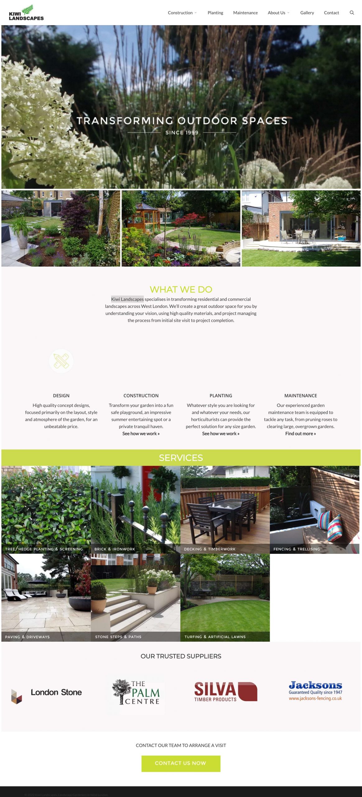
Kiwi Landscapes (Not a One Base Media design)

We love the design of this website. It is modern and sleek, with high-quality photos. The use of white space makes it easy to navigate and easy on the eye.
Also, the banner instantly says the company has been trading since 1999. This builds trust immediately, telling people the business has been trading for over 20 years.
The services are neatly laid out under the banner, and the suppliers are easy to see on the home page.
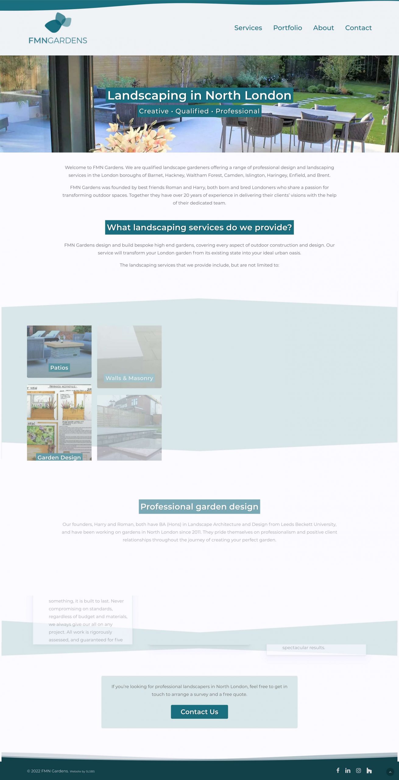
FMN Gardens (Not a One Base Media design)

We like the simplicity of this website. The navigation is straight to the point, services, portfolio, about and contact.
This is a perfect example of less is more and directing users to the pages they want them to visit.
Also, each page is designed and showcases the work beautifully. This is a straightforward but effective website design.
Lucente Landscaping (Not a One Base Media design)

The first thing that stands out on this website is the large-high-quality photos. This imagery is a great way to show off the company’s work and capture the user’s attention.
Using a contact form in the banner is great for collecting leads. Also, the “request estimate” button at the top of every page is a great way to direct traffic to a lead generation page.
The website also has a link to download their app. Having an app is a great feature and shows this company have gone the extra mile in building its online presence.
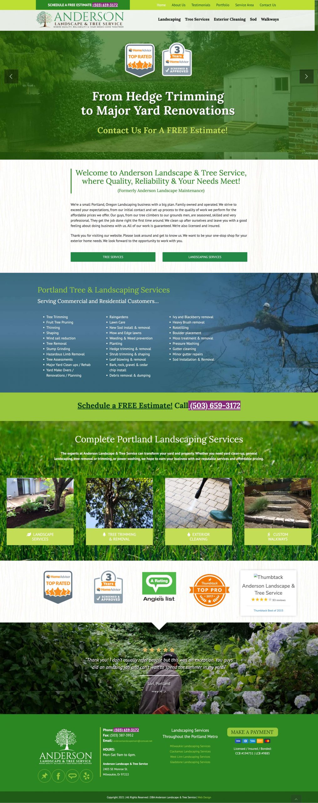
Anderson Landscape & Tree Service (Not a One Base Media design)

Awards are a great way to show users that you are trustworthy. The first thing that stands out is the badges on the banner, instantly building trust that they are approved contractors with these organisations. They also state in the banner that they are award-winning and the location they cover.
The website has sticky navigation, so when you scroll down the page, you never lose the navigation and know where to click next.
The website also nicely uses high-quality images with a parallax effect when scrolling down the page.
Gibbs Landscape Co (Not a One Base Media design)

The services page is laid out in an easy-to-read format with clear descriptions of each service.
This is a great way to inform potential customers about your services without bombarding them with too much information.
Overall, this is a well-designed website that uses simple yet effective techniques to showcase the company’s work which will help generate leads.
We particularly like the use of the video directly under the banner where there is a narrator clearly explaining the reasons for using the company.
The request a quote button is a nice touch so customers can easily find where to get a quote on every page. The website also has an excellent blog that generates a lot of organic traffic.
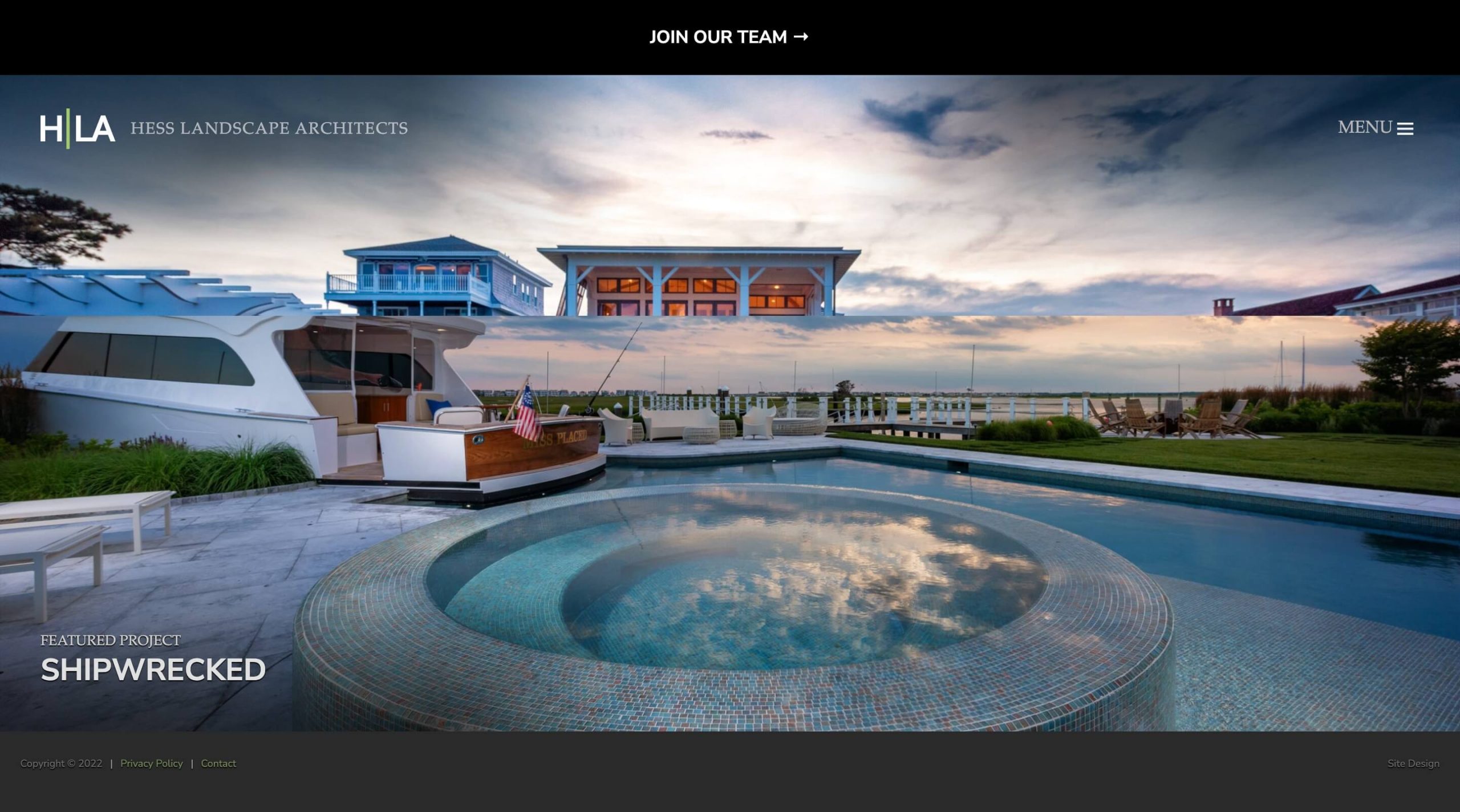
Hessla (Not a One Base Media design)

The first thing that stands out is the auto-playing image banner; this is a great way to capture the user’s attention and give them an insight into the company’s finished services.
The big, bold images on the banner showcase the work’s quality.
The pop-out menu in the top right is also straightforward to use and has only a few tabs for the user to navigate through.
This simplifies the user experience and directs the customer on where the business wants to take them; this website intends to show the quality of the work and information about them.
Overall a simple but effective website that we are sure generates a lot of leads for them.
Need to improve your landscaping website?
If you want to take your landscaping website to the next level, call us. We have built hundreds of websites for tradespeople and helped them get better-quality leads for their businesses.

Speak to an expert
Got a quick question about your landscaping marketing? Or you want to run through the details of your next big project. We can help.
Speak to one of our experts today on 01702 668207 or send us a message.
