
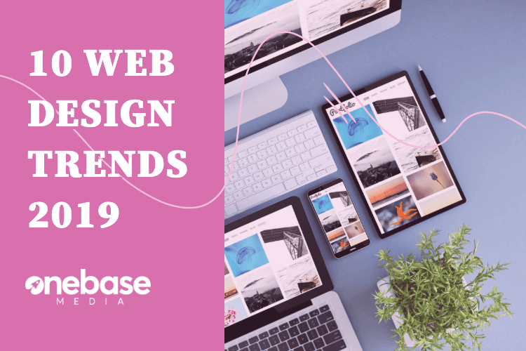
Web Design will always be changing and evolving, this is due to trends changing. As the trends of web design change the overall look of a web design for a website will change too.
Why? Because as a business you want to look professional, sleek and modern, keeping up with the trends as they grow will help your businesses website do exactly that.
Here are 10 trends for web design that are said to completely evolve in 2019, therefore you need to know what they are and how they work in order to keep your site relevant.
The End of Traditional Web Design.
The concept of traditional web design is fading away in today’s generation! Traditional web design was more to make the tech look good for it’s audience.
Well in 2019 web designers can longer just make websites “look beautiful”, they need to look into and think about the users experience and they expect from a website.
In 2017, your users will be the key to building a web design for your website and not listening to them will not look good for your website.
Next Generation of Responsive Design.
Responsive design will continue to dominate in 2019, the reason being over the last couple of years it has become one of the most effective ways of achieving a good user experience (UX).
In April 2016 Google changed its algorithms to prioritise responsive design websites over other websites, therefore in 2017 rankings will continue to change if your sites is not responsive.
Therefore 2017 will see a change in the number of responsive design websites, meaning businesses have opted for the responsive design option in order to get the best out of their website rankings.
Minimalistic Web Design.
Minimalism is going to become a big thing in 2017! Instead of being hit with a homepage users will be presented with a ‘card’/’cards’, which are entry points which act as doorways to further information.
A website may choose to have multiple cards, which visually suggest a topic and entice users to click.
An example is Netflix, they use cards as images to present the different movies, that you can click on to get more information. They decided to use this design over a standard design as it de-clutters the page and makes the site look visually pleasing.
So basically people want a de-cluttered, simplistic and visually explanatory web design, so keep this in mind when designing your website in 2017 as minimalism is rising for 2017 web design.
Fewer Stock Photos, More Authenticity.
There has been a decrease in the amount of stock photos used on websites!
The reason for this is because people prefer to see bespoke pictures which really relate to the business, rather than just a generic picture that anyone could use.
Photography is an art form, in 2017 its become more powerful than in previous years, which makes the rise for more authenticity something all businesses should consider in 2017.
However, the important thing to remember is your website serves a purpose to users, along with everything on it, meaning the images must serve a purpose too.
Typography Goes Big.
While 2016 saw a rise in size and ‘out-there’ designs, we have discovered that in 2017 typography is just going to get bigger and bolder.
In fact brands are opting to go big, more eye-catching and even full screen with their typography.
Dynamic colours and textures will be added to the interesting a vibrant fonts to create an overall ‘wow’ effect in 2017.
It seems that typography works well for both drawing and keeping user’s attention, it can be used effectively to break up the grids, especially if the site has a long scrolling page.
More Brands Adopt a Mobile-First Approach.
This isn’t new to 2017, it has been a round for a couple of years now, but with mobile devices officially named as the primary device used for browsing the web, especially in the UK, more companies are realising the importance of having a mobile friendly site.
The restrictions a smartphone brings in terms of how much content a user can see, allows brands to consider what their core content and message is that they want to communicate, to ensure that on a mobile device that’s what users see first.
However when users switch to a bigger device such as; a tablet or desktop, they will be able to see more information on the site, eventually being able to see all the content on screens like a desktop computer.
So, in 2017 we will see a rise in businesses changing their sites to Mobile-First, as sites are now being ranked better by search engines if they are mobile friendly.
Video Becomes King.
Video instantly grabs a user’s attention, which is why it has become very popular in terms of a 2017 trend for web design. Drawing them in with a video allows brands to carefully get across their message.
It is by no means new, however it has become a very useful tool for businesses for story-telling, marketing , etc.
It has several advantages over traditional photography, because photography is static and motionless, whereas video is more dynamic, using sound and movement to appeal to users.
Which is why video is on the rise for 2017, businesses are realising it’s a popular tool to hold user attention.
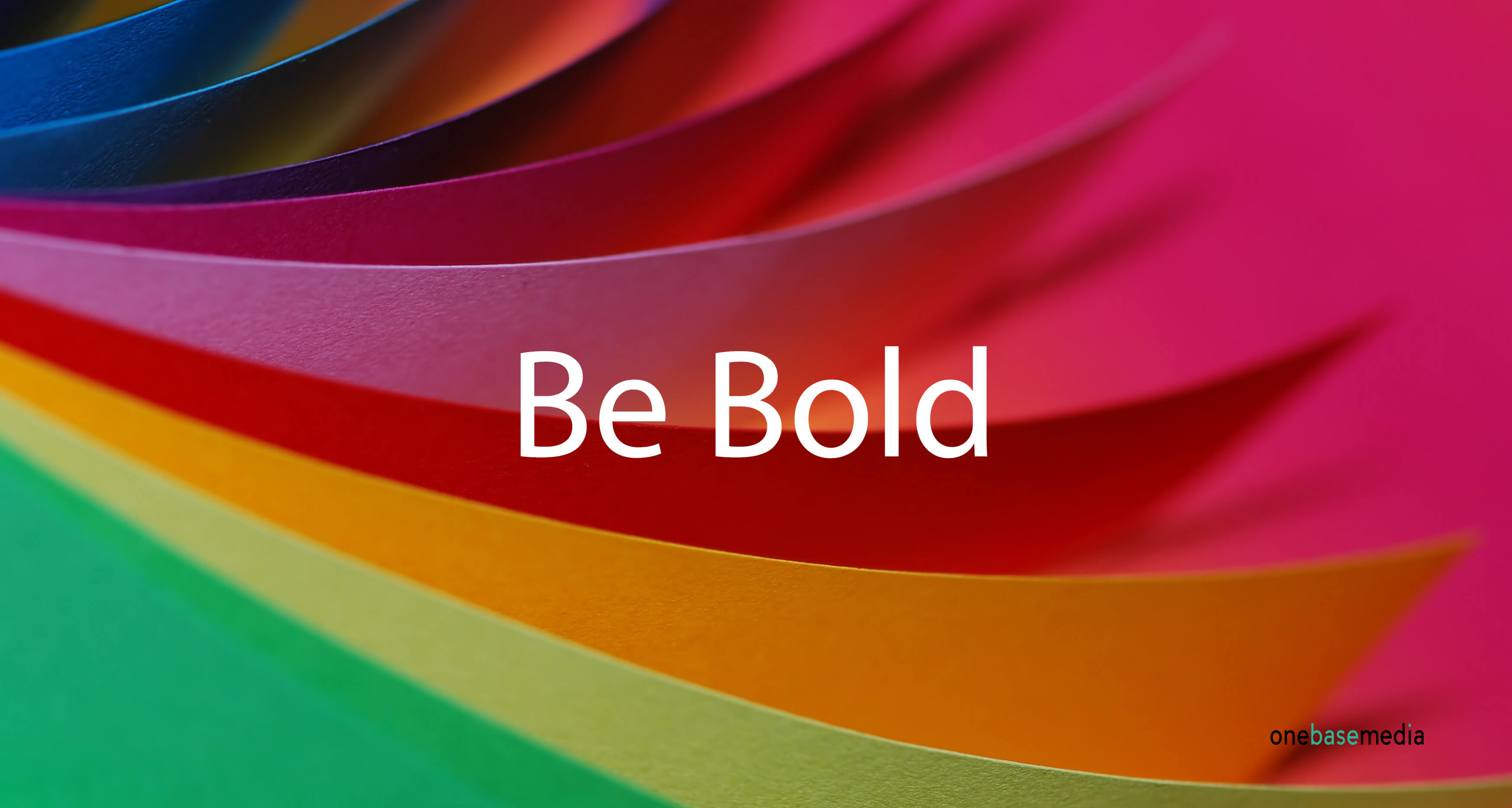
Courageous Colour.
2017 is seeing a rise in bold colours, whereas in the past businesses have gone for the web safe colours.
More brands today are being braver with their approach to colour for their web design, as we are seeing with over-saturation, vibrant hues and a resurgence in the use of gradients.
The use of bold colours is a help to web design because it grabs user’s attention more, it also helps with brand definition, which will help you stand out above competitors.
An example would be Spotify, they decided to change their colours, updating their branding, moving away from their well established and safer ‘green’, they decided to move to a more noticeable vivid hue.
In 2017 we will see brands following Spotify in their approach and get a little braver with their choice of colours.
Innovation Scrolling and Parallex.
Scrolling once reserved for getting from the top and bottom of a website is now in 2017 taking a more creative approach in delivering content online.
Before designers where concerned about keeping important content above the fold, it’s coming harder to define that fold because users are viewing content on different sized screens and resolutions.
Scrolling is becoming a versatile mechanic which (if executed well) can work great with a variety of content delivery, such as; videos and animations.
With many high profile businesses implementing scrolling and parallex, we expect in 2017 the clever use of this will rise more and more.
Gradients.
They are making a major comeback, especially for 2019!
Gradients now use big, bold and plenty of colour, currently the most popular gradient is the two colour gradient over a picture and we expect that to grow in 2019.
Its a great opportunity for you to switch up the look of your website and be a little more eye-catching to users.
Also it helps you to grab users attention to your site if you do not have any imagery to work with.