With 2017 in full speed, graphic design trends are changing a little.
Many of the 2016 trends will continue to show themselves in 2017, however there are a few new trends that are set to make an appearance and change graphic design in 2017.
Here are 6 trends to watch out for, in order to make graphics brilliant for 2017!

Responsive Logos
These logo’s have been designed to keep up with an increasing selection of formats and scales that are now becoming available to users. So, scaling down for mobile devices doesn’t only mean making things smaller, a good responsive logo will adapt and respond to its environment and still be functional. With more and more mobile devices being available to us everyday, it means the responsive logo will continue to rise in 2017.Cinemagraphs
There are still photographs where a single and small movement is made, and the image will usually come as a GIF. These cinemagraphs are an incredibly simple and effective way to grab users attention quickly. With the competition growing, you should expect to see cinemagraphs come into play for 2017.Illustrated (hand-drawn) Images
Illustrated images are great for adding a clearly human element to graphic design, making your brand feel a little more human to users. They can be used in a huge range of situations but are becoming more popular as a way of explaining or illustrating aspects of your brand or product, such as; instructions for a product or service. 2017 will see an increase in these types of design as their ‘sketching’ and ‘independent’ quality becomes more popular amongst users.Bold Photography and Sleek Text
The mix of bold and sleek images and text has started to captivate users, making them more aware and interested in your brand. The photography and text tend to work together to create great contrasts and borders for graphics. Therefore, in 2017 this will continue to rise, because this is being seen as a great way of interesting users to the brand and making yourself more aware to other users.Modular Layouts
They function to break up text and put it into manageable chunks. We have found that making the information more manageable makes users interact with the design more. Furthermore, modular layouts can look very professional as long as they are done right, which is a great way of making your brand fresh, new and in users eyes interactive. So, for 2017 you should expect this to rise, and take it into consideration when talking about your design for your brand and website.Duo-tones
This is the combining of two colours on an image, usually with the use of very bright or contrasting colours. This bold use of contrasting colours will also bring some originality into your design and brand. Duo-tones don’t always have to be bright and contrasting colours, using simple and delicate colours may be better for you especially if this goes with your brand colours. This will be something that will continue to rise in 2017, making it something to consider in order to make your brand stand out to users.Colour Transitions
Colour transitions have become one of the biggest design trends now. It all started in 2016 and is set to quickly rise further in 2017. This trend has started everywhere from logo, buttons and picture overlays, and some big brands have decided to follow this trend, one being Instagram, they changed their logo to a more modern camera lens with a colour transition from orange to pink to purple. For 2017, we are expecting more business to adopt this trend for both their printing and web design.Pattern and Geometric Shapes
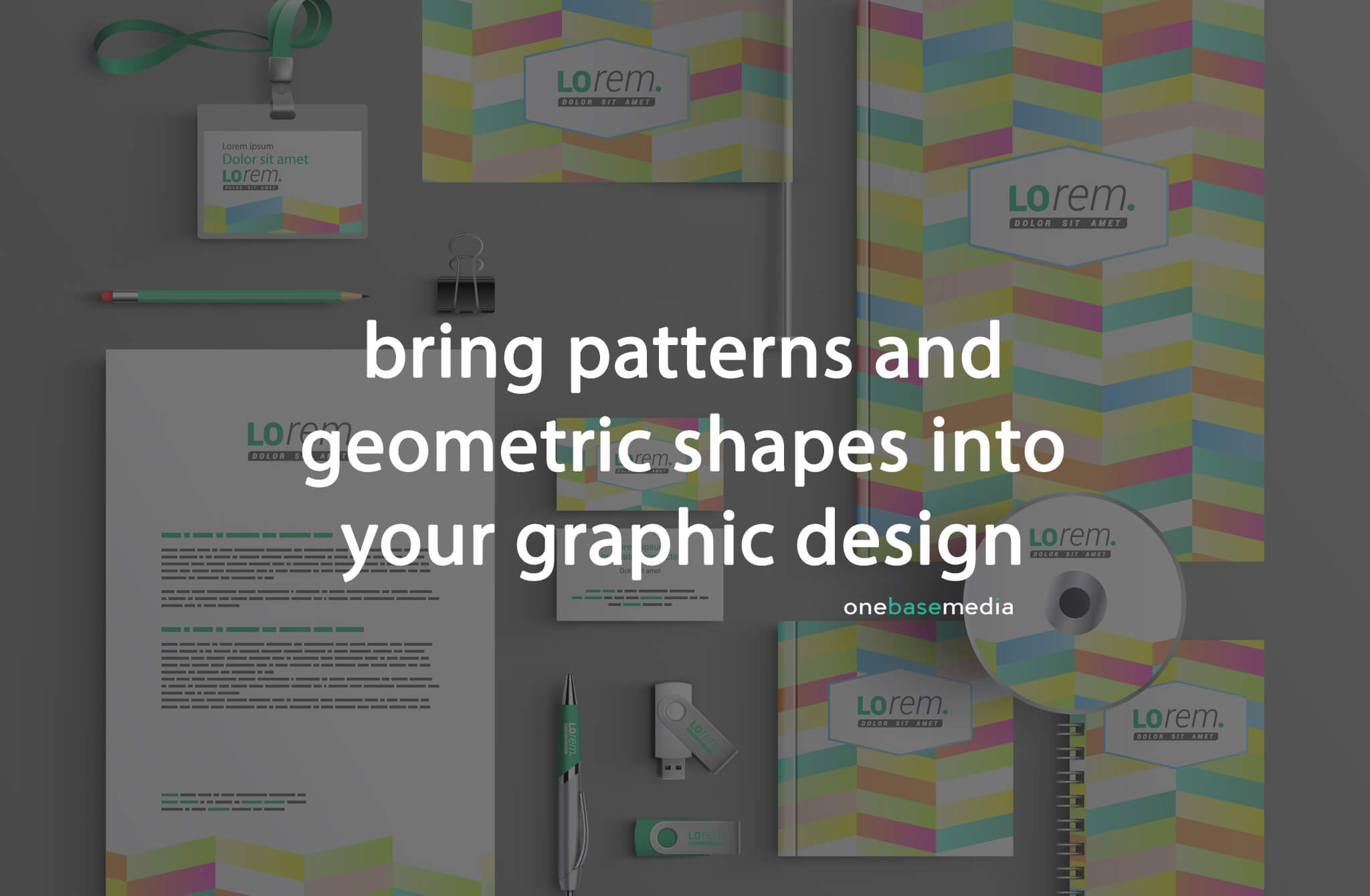
This trend started in 2016 and it’s one that will continue to rise in 2017, furthermore in 2017 you should expect to see more natural inspired patterns such as; marble, precious stones and plants. It’s set to bring a crafts vibe to media, especially as painted patterns contrasted with simple typography come into trend for 2017. Furthermore more for packaging and brand design will bring together the best quality of flat design and pattern, and will create a vibrant, colourful products, which will bring a contemporary and artistic trend to a business’s branding.
Modern Retro
This trend has been around for a while, however it seems to be rising for 2017, modern flare added to retro designs, typefaces and colour palettes make for an interesting fusion of old and new. The key for this trend is both authenticity as well as simplifying and modernising any element that stood out from any time in the past. So for sure this preference for 2017 will continue to grow and we haven’t seen the end of this trend yet. So, as 2017 continues and you are deciding to get some graphics created for your brand, considering these 8 trends within 2017 so far will help you take your brand to the top, as branding is key to the success of a business.
Speak to an expert
Got a quick question about your marketing? Or you want to run through the details of your next big project. We can help.
Speak to one of our experts today on 01702 668207 or send us a message.
