Construction website design | 32 of the best designs

  • October 17, 2022
  • obm
  • 11 min read
Construction website design | 32 of the best designs

Are you in the market for a new construction website? If so, you’re in luck! In this blog post, we will showcase 10 of the best construction websites. These websites are sure to inspire your next redesign and help you create a website that is both visually appealing and user-friendly.

What makes a good construction website?

First and foremost, it should be easy to navigate. Users should be able to find what they’re looking for without trouble. The website should also be visually appealing; first impressions are everything!

Include information about the following for your construction company website:

  • Your services (Have a page dedicated to each service)
  • Your accreditations (This will build trust that you are an excellent business to work with)
  • Your reviews (Have reviews throughout the website)
  • Use calls to action (Have clear buttons to push the user where you want them to go)
  • Your team (Have pictures of your team and their role in the company)
  • Past projects (Have case studies, go into detail about the project)
  • So without further ado, let’s look at some of the best construction websites!

32. Garden rooms 365 (One Base Media design)
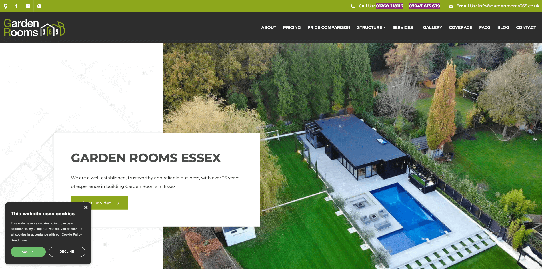
garden room construction website
Garden Rooms 365 designs and build garden rooms throughout the Essex area. They showcase their work beautifully and have great videos. Their services page is clear and concise, and their reviews are prominently displayed on the website.

31. TJ Qualified Building Solutions (One Base Media design)
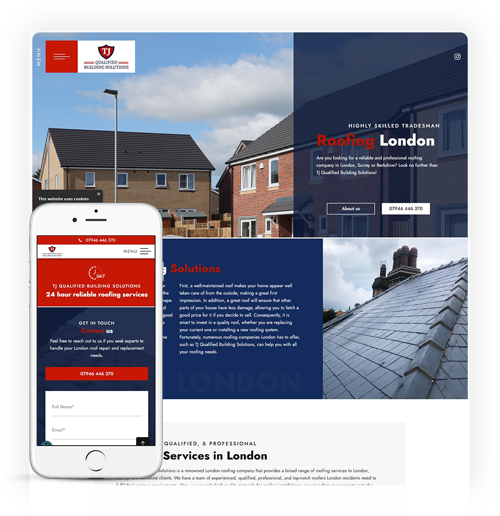
TJ Qualified Building Solutions, construction web design
Based in London, TJ Qualified Building Solutions is a roofing and building contracting company covering London and all the surrounding areas. We like the navigation on this website, as it is unique but easy to use. The website also does a great job of showcasing the work that TJ Qualified Building Solutions has done.

30. All Division Building (One Base Media design)
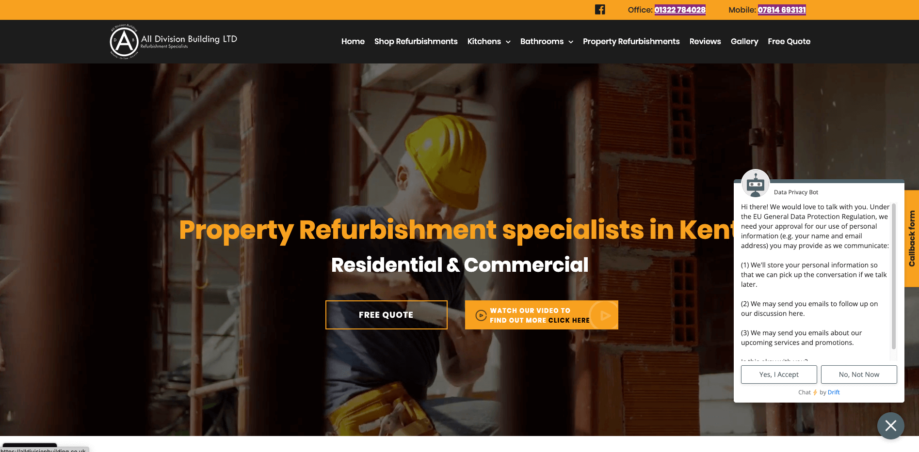
all division building construction web design
All Division buildings are a shop refurbishment and property renovation company in Kent. The website uses excellent video throughout, in the banner and video testimonials from customers. We also really like the use of the dark background and the orange buttons pop out.

29. Castle Point Construction (One Base Media design)
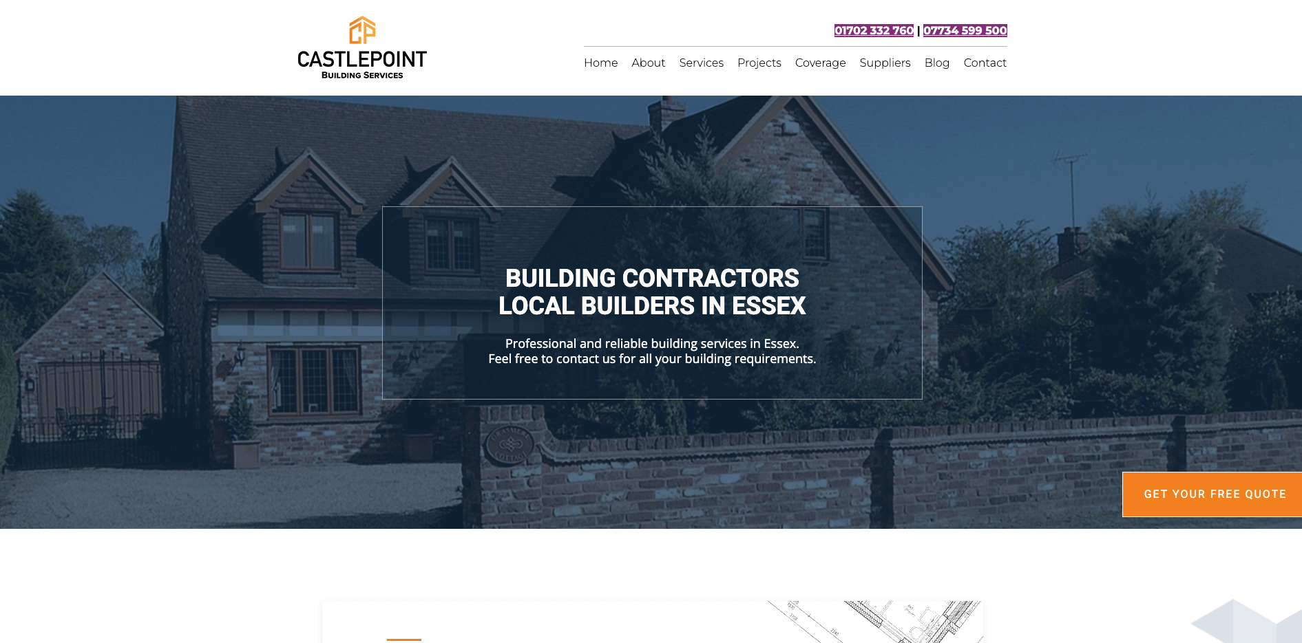
castle point construction website design
Castle Point Construction are a general contracting firm based in Essex, specialising in all aspects of building refurbishment. The website has a simple, easy-to-use design that includes excellent calls to action and nicely lays out the case studies.

28. E.O. Jones & Sons Construction (One Base Media design)
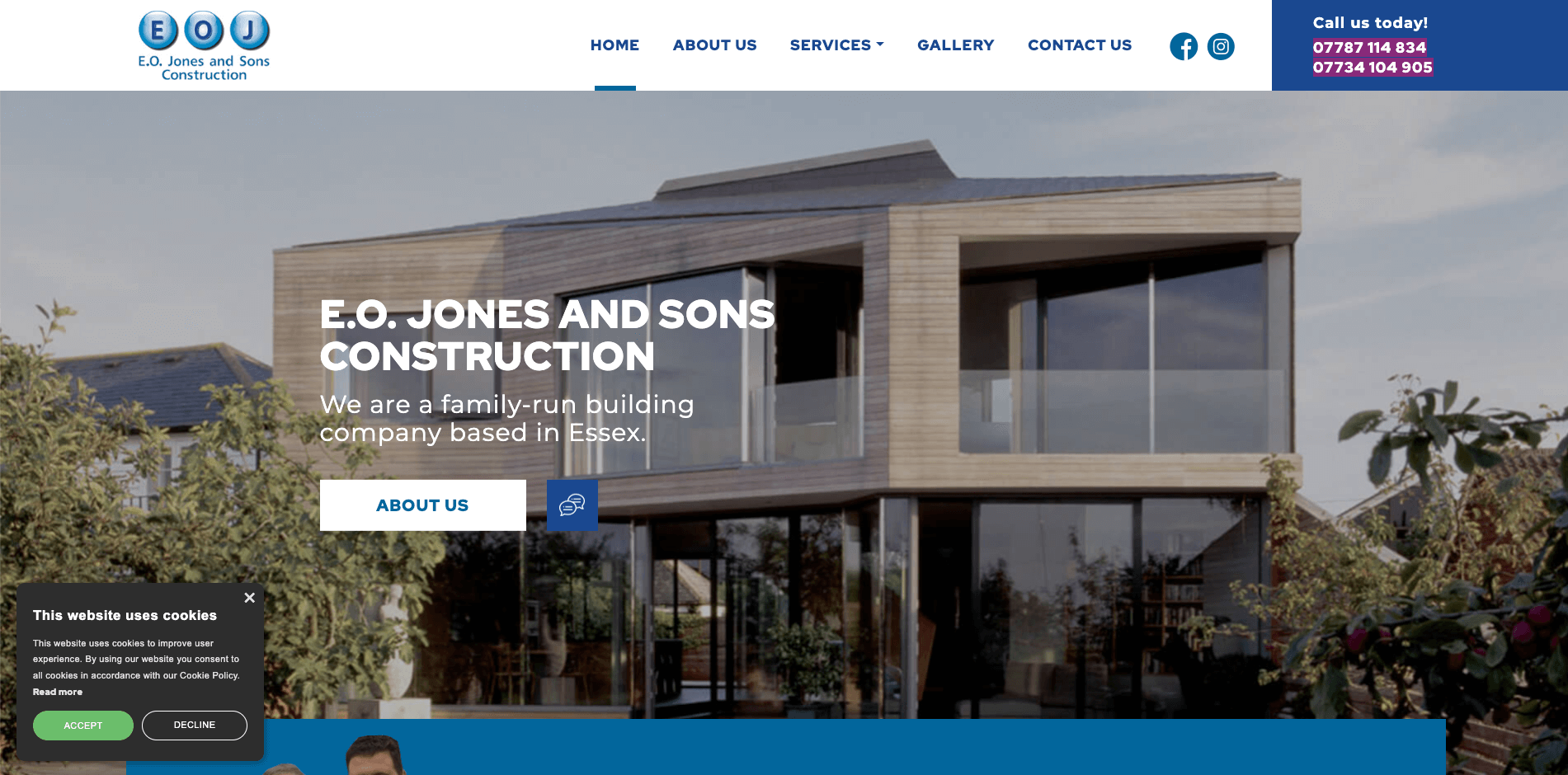
eo jones construction
E.O. Jones & Sons Construction are a construction company based in Essex, offering everything from kitchen design and installation to landscape gardening. We like the use of colour, and the way you can see, this is a well-established family-run business from the home page.

27. SKS Building Contractors (One Base Media design)
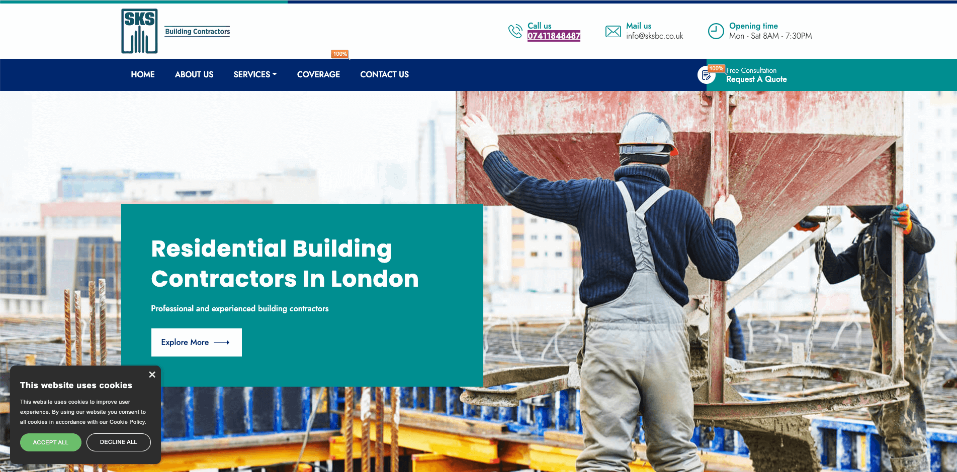
sks building contractors
SKS Building Contractors are building contractors offering everything from rendering and plastering to kitchens and bathrooms. Their website has a lovely colour pallet and uses branding very well throughout the website. Also, great use of calls to action in the main navigation.

26. Desert Star Construction (Not a One Base Media design)
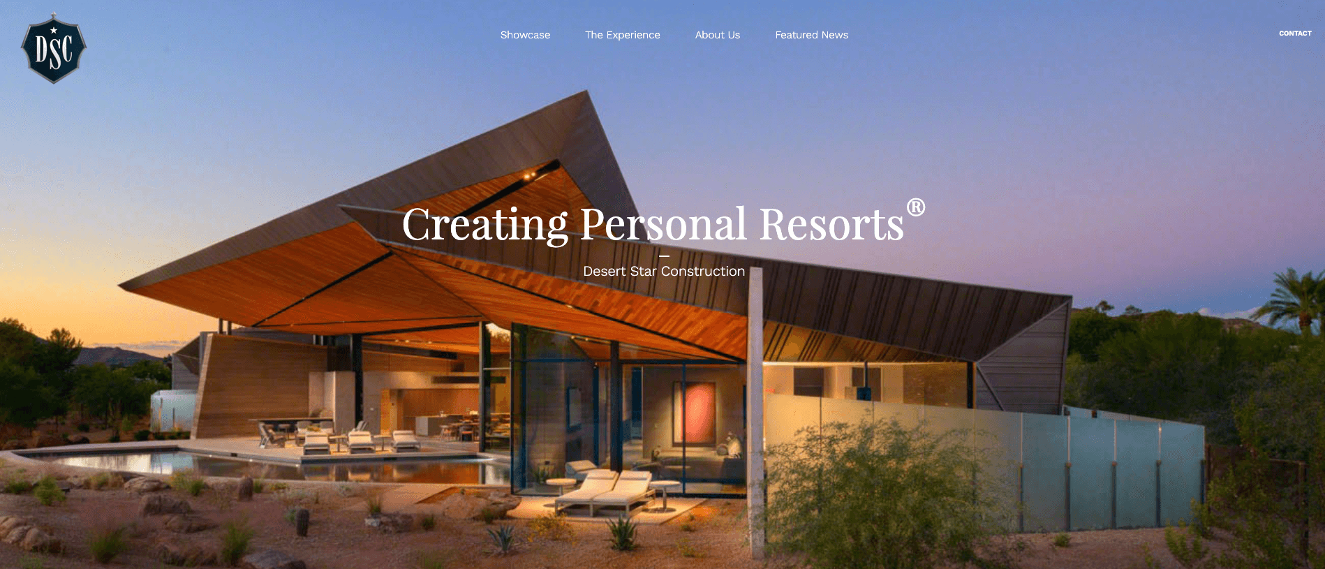
desert star construction
Desert Star Construction is based in Arizona and is an expert in building new homes. The main banner instantly grabs your attention with the modern design of the building. As you scroll down, you can see they are a well-established family-run business.

25. Probuild Management (One Base Media design)
Probuild
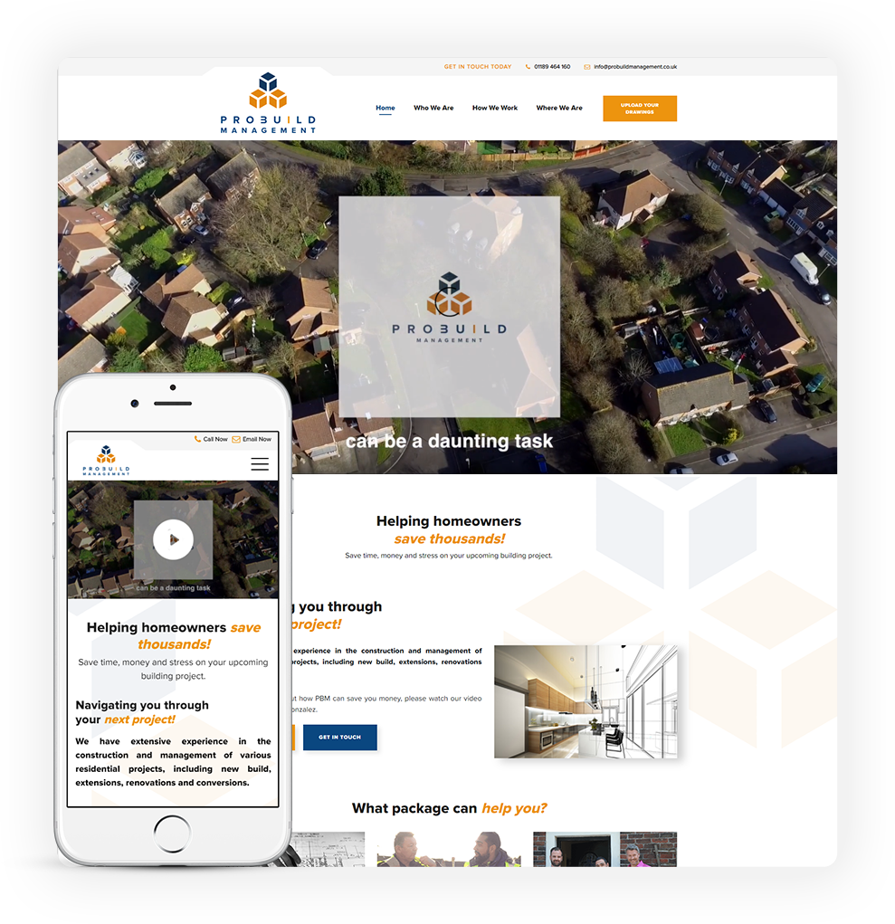
Probuild Management is a building contractor who has done some fantastic projects that have got them starting roles on TV shows. We like the main banner message, telling the customer straight away they help homeowners save thousands; also, the website uses the colours and branding very well throughout. We also like the calls to action to upload the drawings. This unique call to action tells the user precisely what to do.

24. ABC Seamless (Not a One Base Media design)
abc seamless
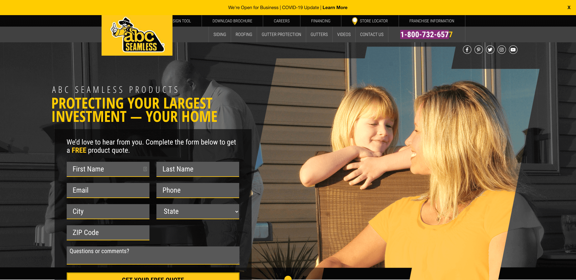
Since 1978 ABC Seamless has fitted steel products into homes throughout the USA. The website has a friendly and family-orientated vibe; using a contact form is a great touch and will help collect leads for the business.

23. B-Mat Scaffolding (One Base Media design)
b-matt-scaffolding
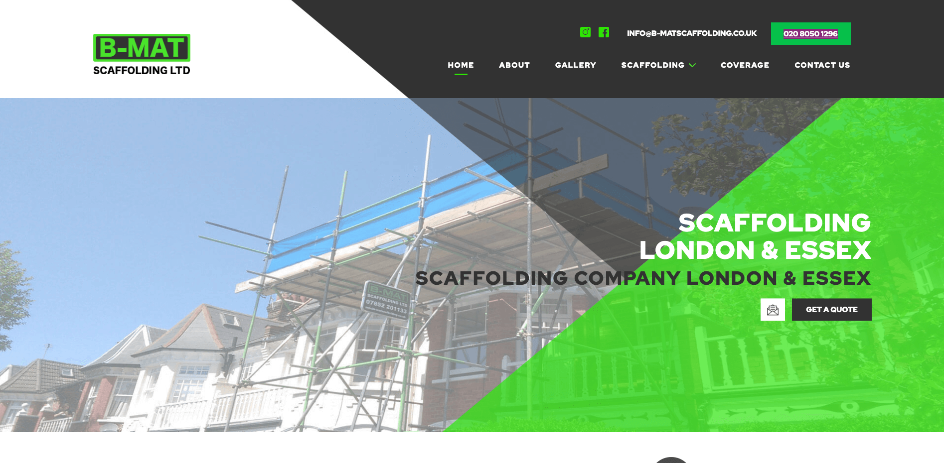
B-Mat Scaffolding is a commercial and residential scaffolder in Essex and London. The website has excellent use of dark greys and light greens; also, the website is very well-optimised and shows on the first page of Google for keywords like “scaffolding London”.

22. Galliford Try (Not a One Base media design)
gallifordtry construction web design
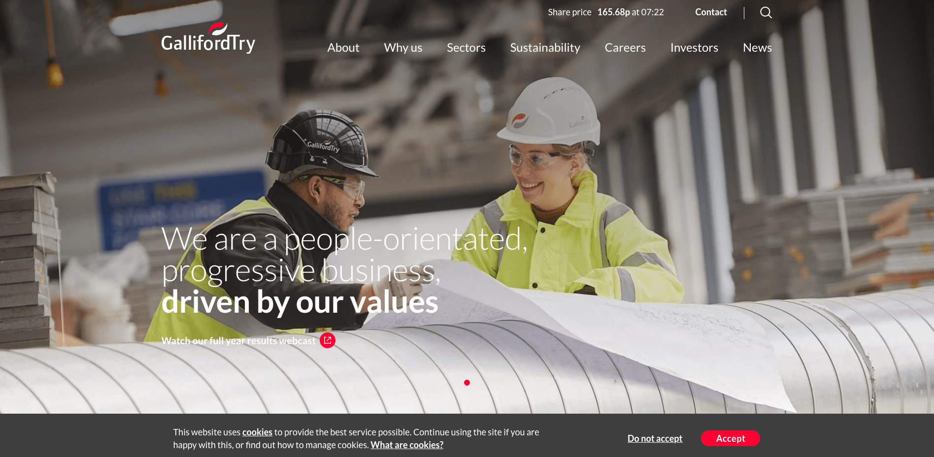
Galliford Try is one of the largest construction groups in the UK, working to build environmental change. The website has an excellent design, and they are regularly blogging to show the big moves the company is making.

21. Weitz (Not a One Base media design)
weitz construction website
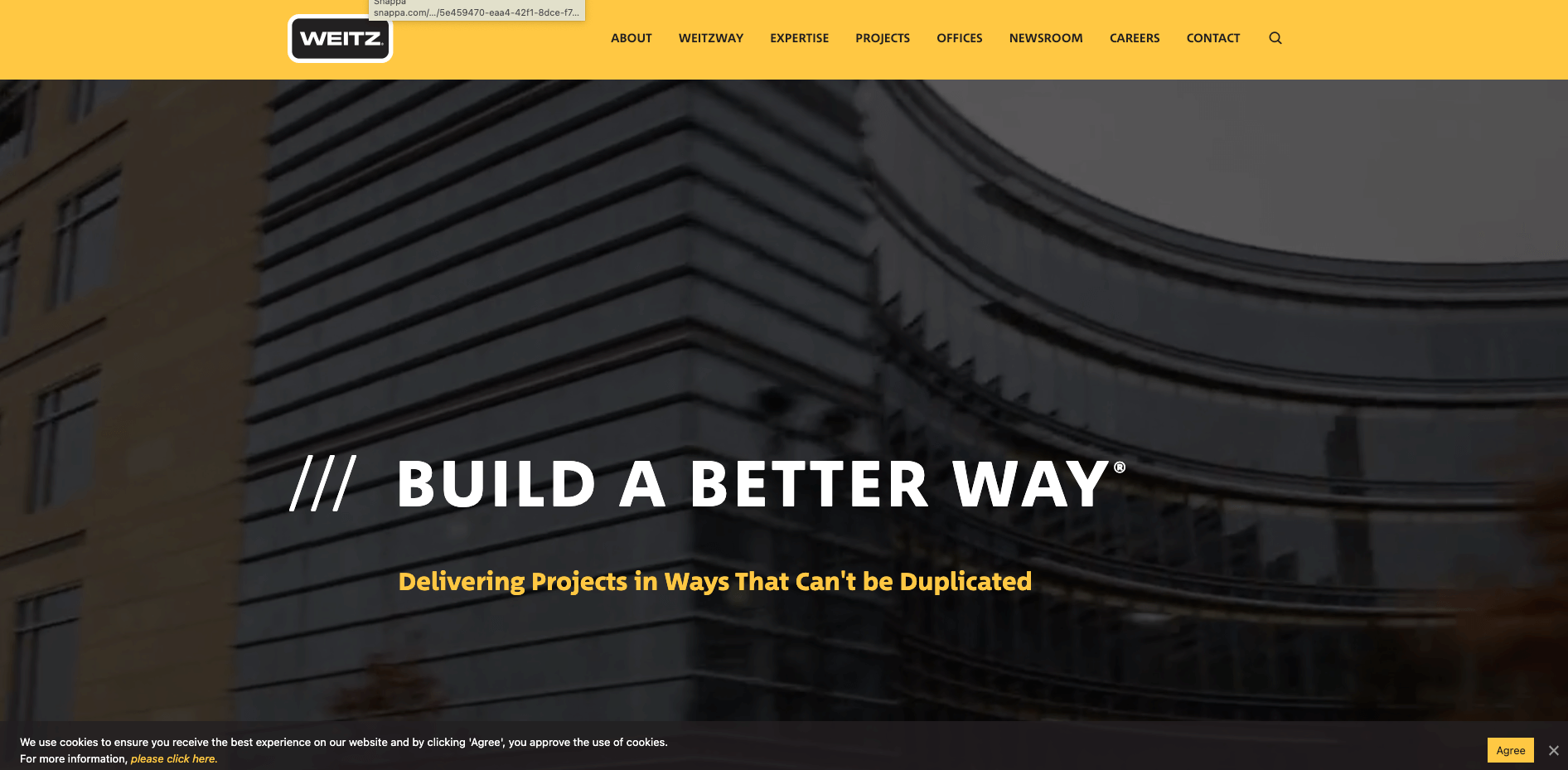
Founded in 1885, Weitz is a full-service construction company and general contractor with offices throughout the USA. The website has a nice video in the main banner that catches your attention. The drop-down navigation is also excellent, going into detail about the company’s different services.

20. Codus Construction Ltd (Not a One Base Media design)
codus construction
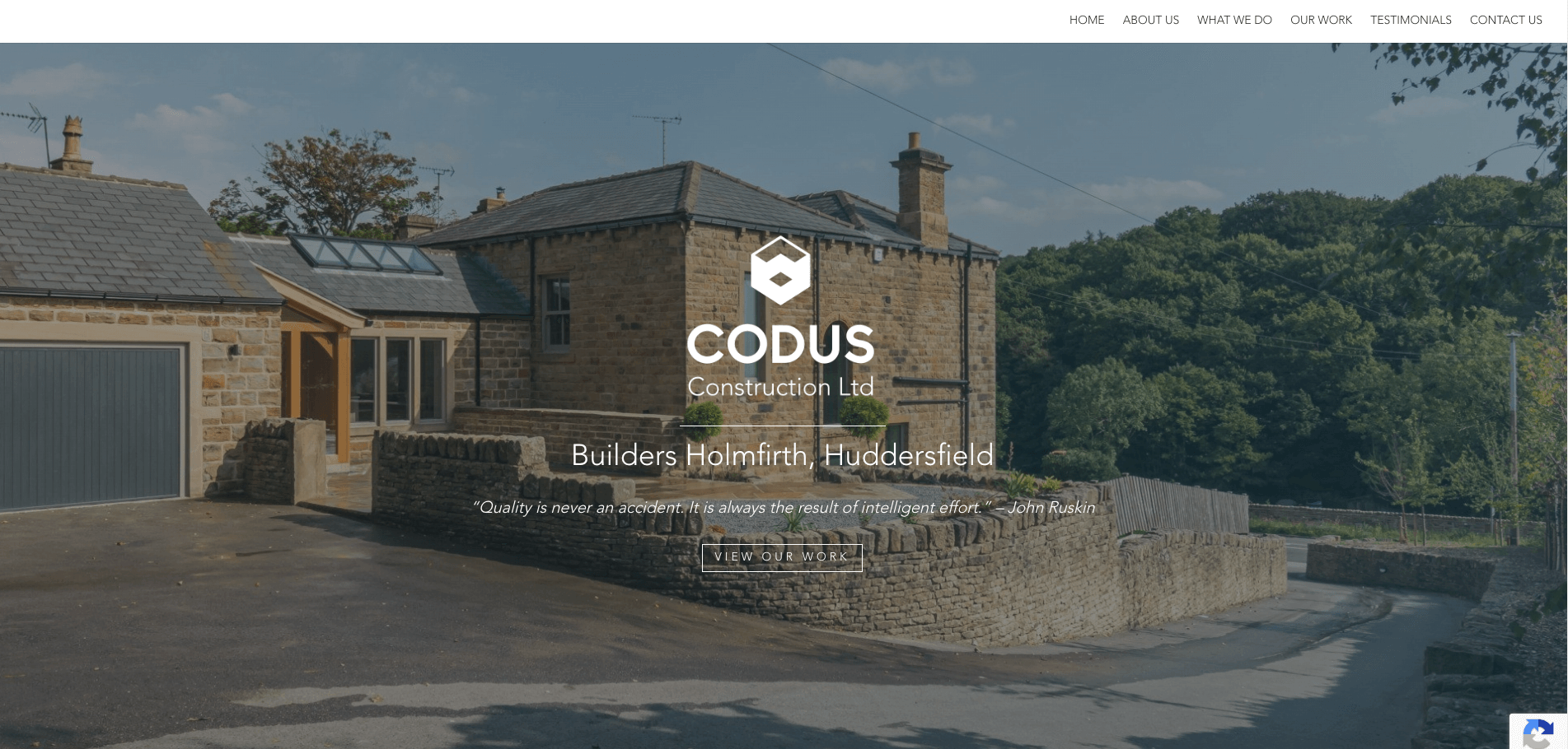
Codus Construction Ltd is a building company based in Huddersfield, Yorkshire. The website is a perfect example of how effective having one page is. When you click on the navigation, it scrolls down to the information beautifully. An effortless but effective design.

19. Ghafari (Not a One Base Media design)
ghafari construction
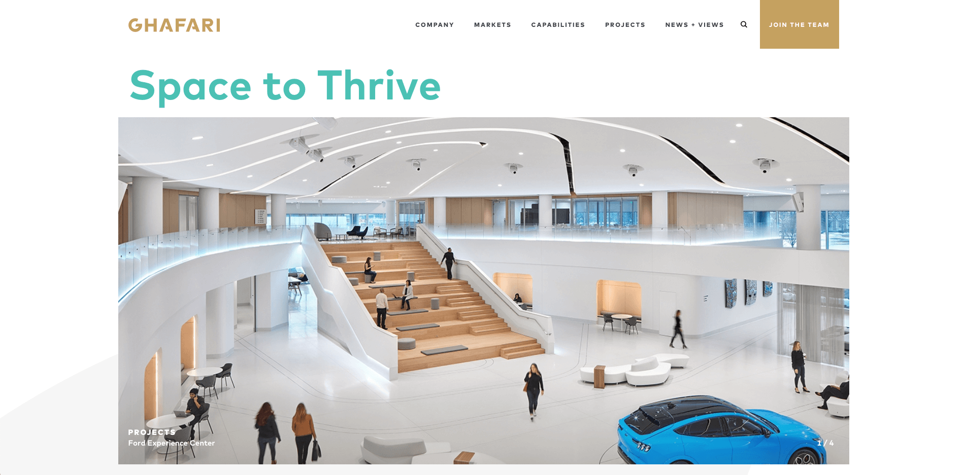
For over 40 years, Ghafari has taken a personal approach to highly technical projects in global engineering, architecture and consulting. The website has a clean and modern design, making full use of white space. We also like how the projects are laid out and have their pages dedicated to each case study.

18. Thorsen (Not a One Base Media design)
thorsen construction web design
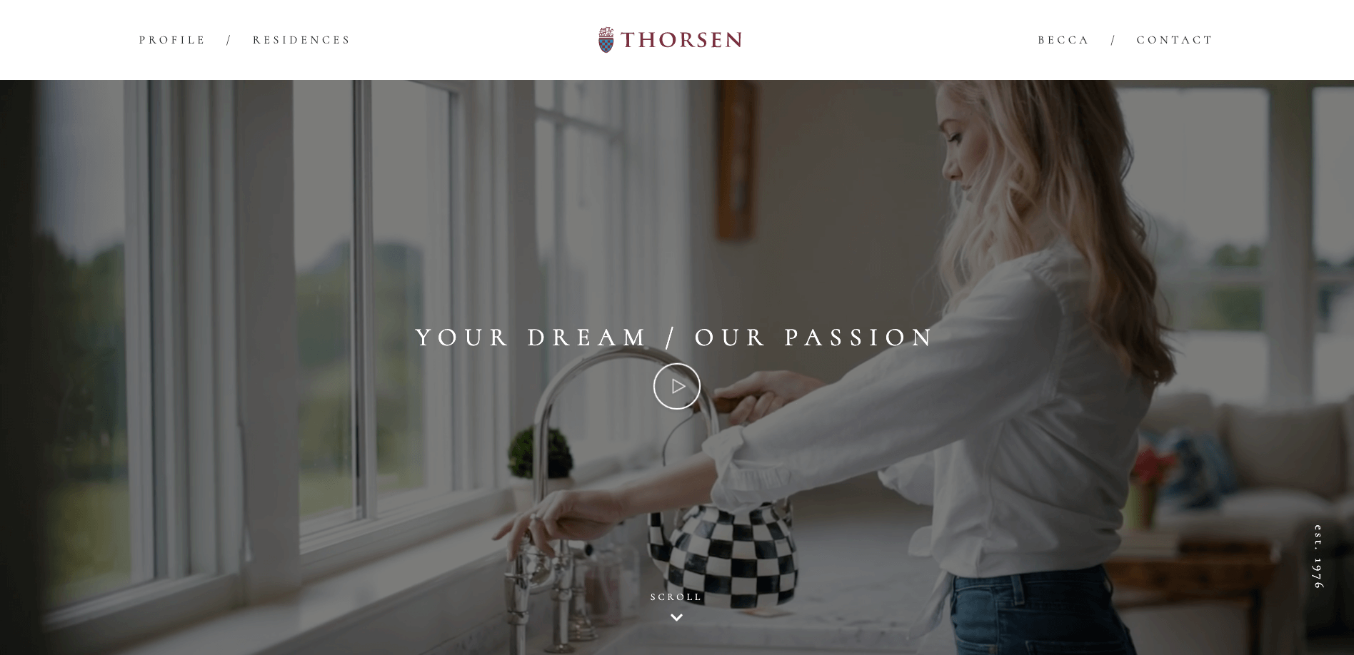
Thorsen is driven to make the home an extraordinary place with its unique design and building. Take a look at their project Country Club Hills. Truly amazing work. The website is straightforward to use but effective in showcasing the incredible work done by the company. Using video in the banner sets an excellent tone for the company.

17. My Home (Not a One Base Media design)
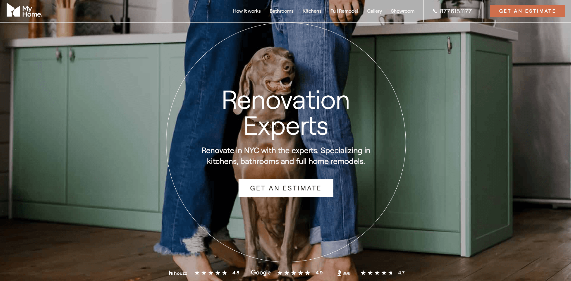
my home construction websites
My Home is a renovation expert in NYC, specialising in kitchens, bathrooms, and Home remodels. The website has a unique banner when scrolling down using animations. The pages are also very nicely laid out, with a page dedicated to showing the entire process of what it is like to work with them. We also like the call to action in the main navigation to get an estimate.

16. Magnolia Home Remodelling Group (Not a One Base Media design)
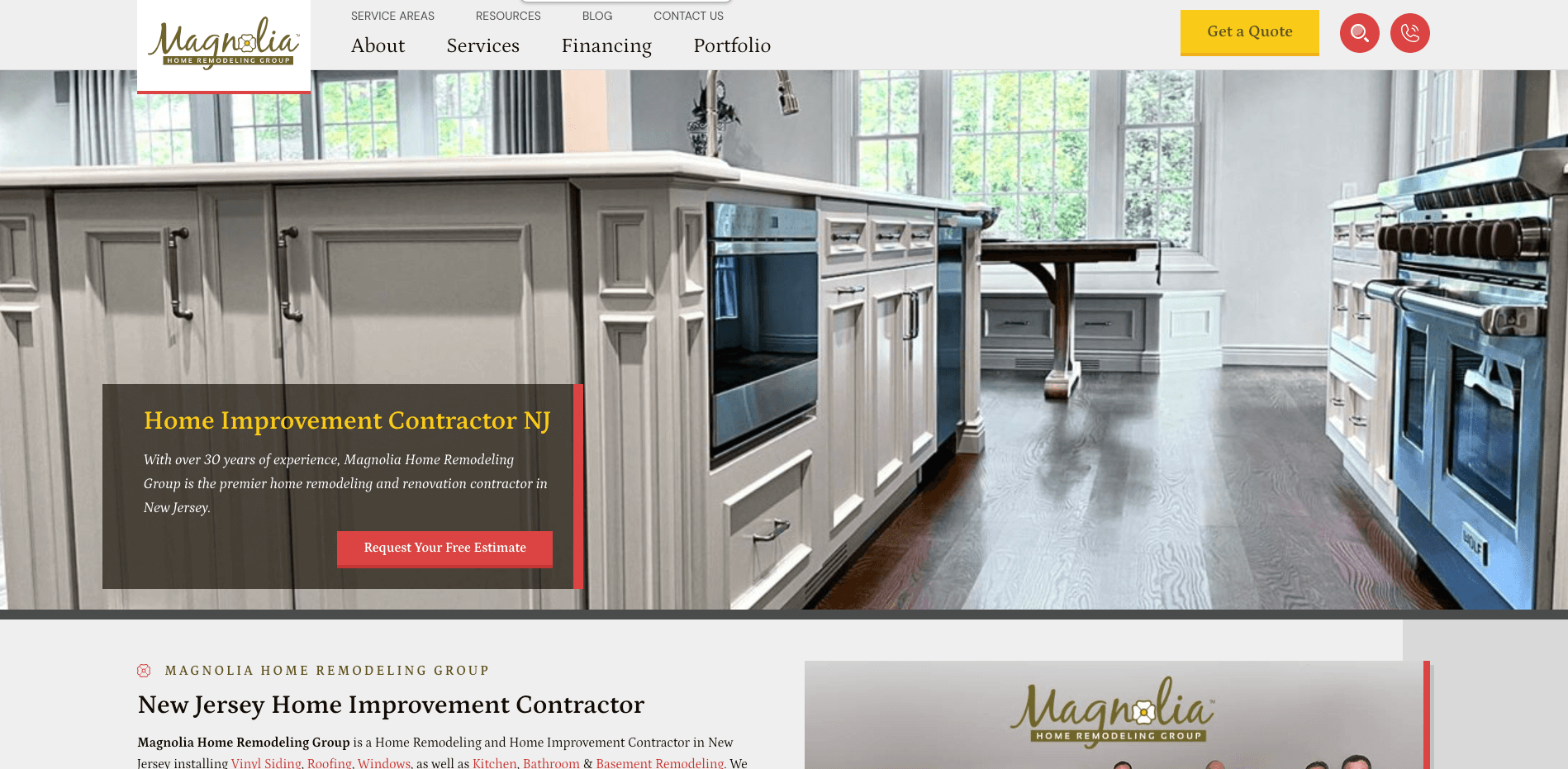
magnolia construction websites
Magnolia Home Remodelling Group is a New Jersey-based remodelling and renovation company with a team of over 30 years of experience. The website instantly builds trust with a picture of the team, and there are great pictures of before and afters of projects. We also like the prominent CTA in the navigation pushing the user to get a quote.

15. Essential Home Remodelling (Not a One Base Media design)
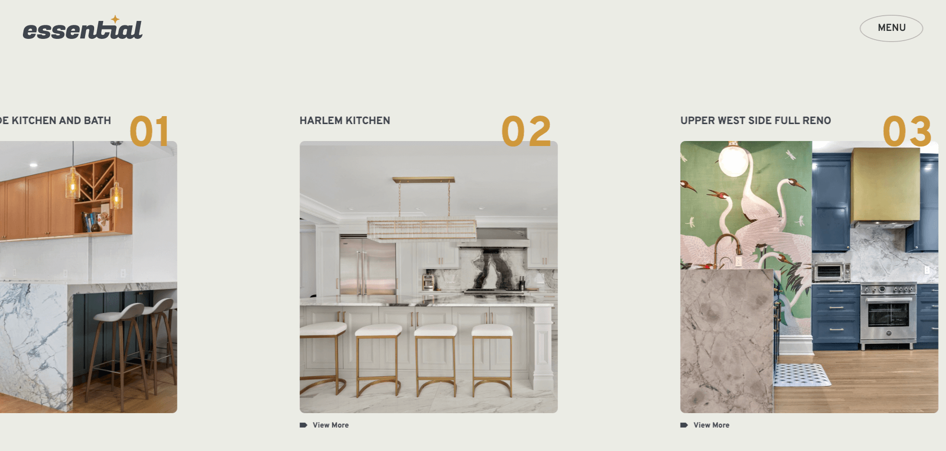
essential
Essential Home Remodelling is an award-winning design and building firm that designs some amazing bathrooms, kitchens and full refurbs. The website uses a quirky design that takes you straight to the projects from the home page. We also like the unique design of the navigation. When you click on the menu, the navigation fills the screen, making it easy to use while being different and unique.

14. WA Construct (Not a One Base Media design)
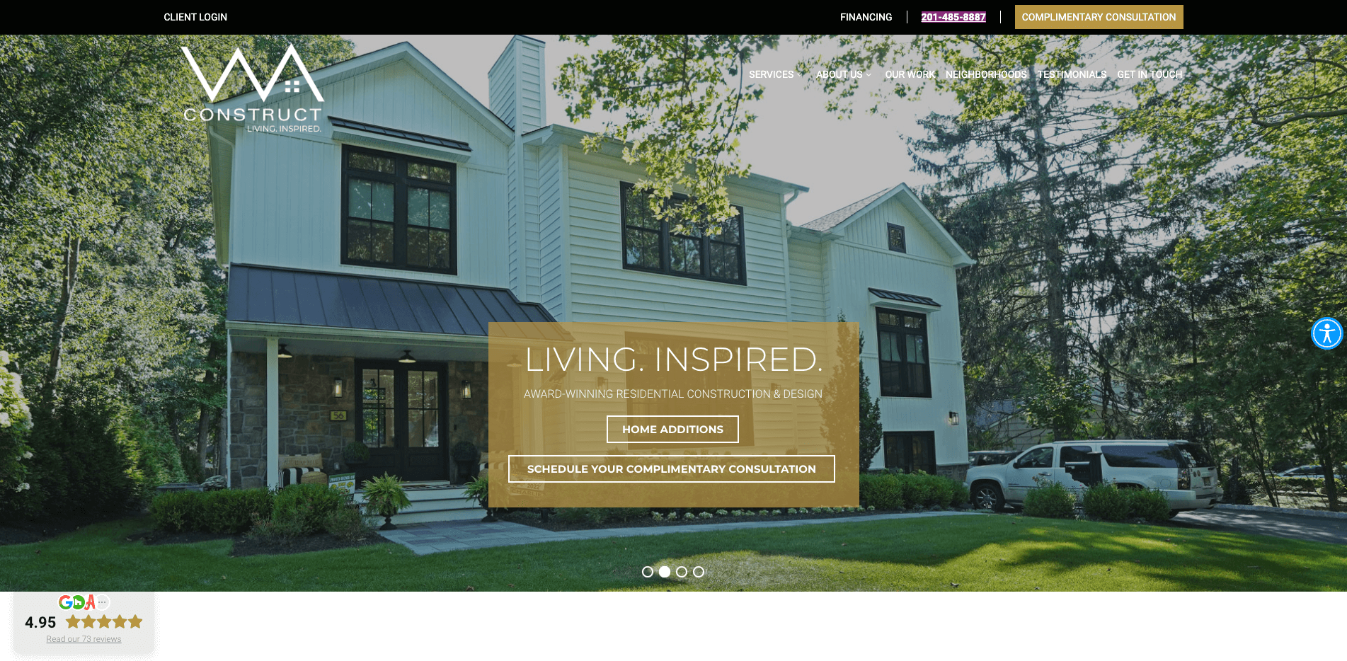
WA construct
An award-winning residential design and construction business, they are on a mission to reinvent the home building experience. The website uses images brilliantly and has great calls to action for the user to book a free consultation.

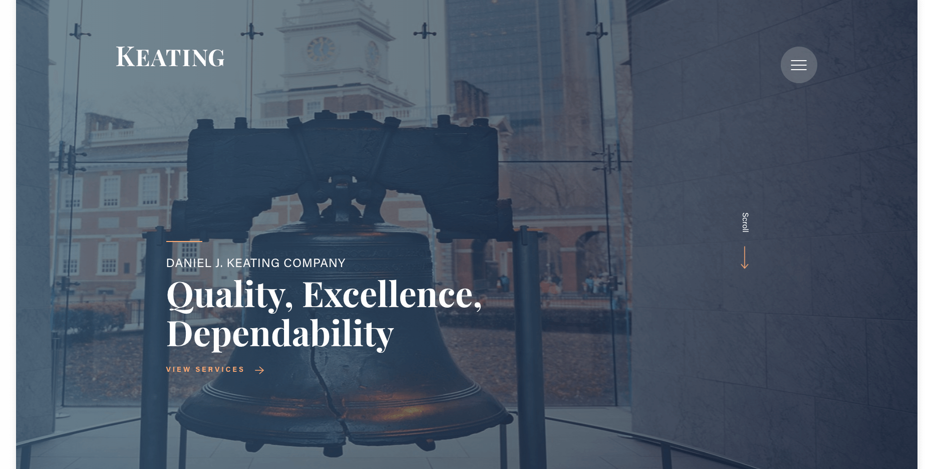
13. Keating (Not a One Base media design)
keating construction
Keating is renowned for delivering some of the finest quality work in construction. They have beautifully laid out a hugely impressive portfolio of work on the website. The use of colour and white space compliments the company branding, and the case studies tell a story of what happened on each project. Simple to use and impressively designed website.

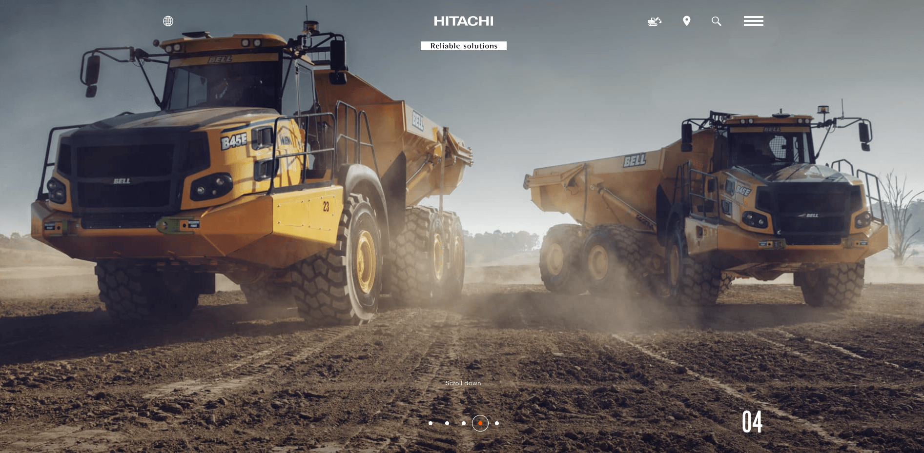
12. Hitachi (Not a One Base media design)
hitachicm

Founded in 1910 by Namihei Odaira in Japan, Hitachi is a diversified company employing over 320,000 people with business activities that include construction machinery, consumer products, power and industrial systems. The website uses a very modern design and has some great images of the different projects they have worked on. We also like how the navigation is laid out.

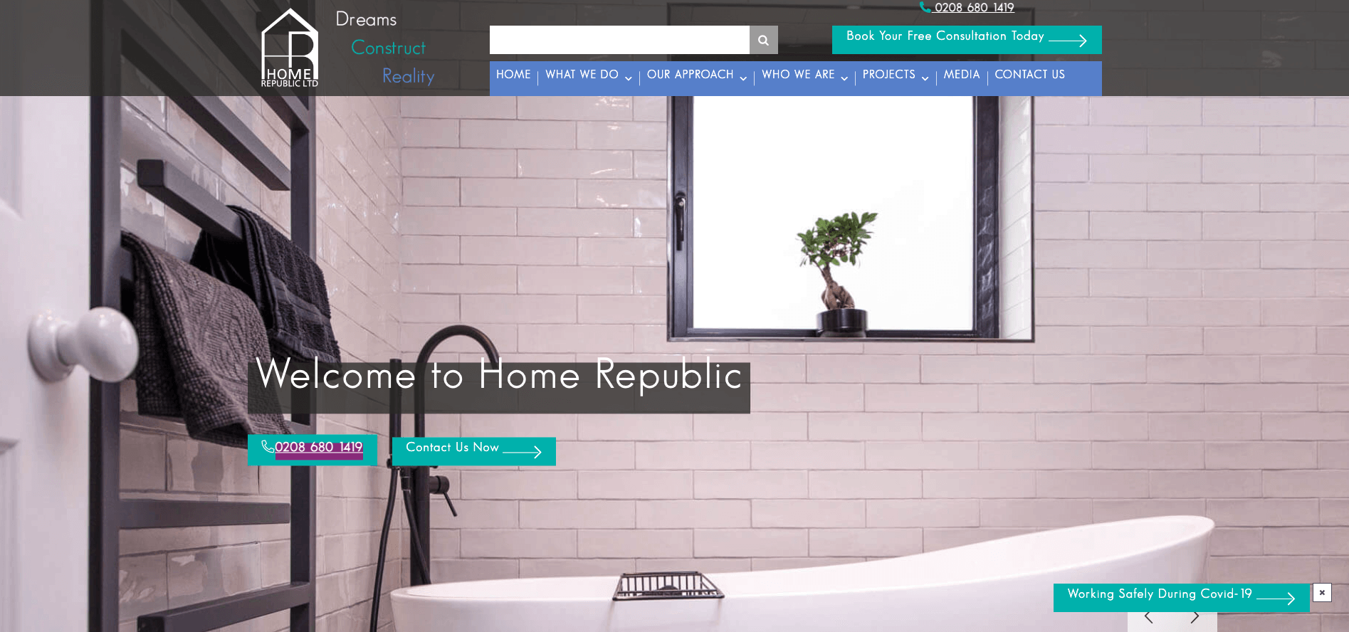
11. Home Republic Ltd (Not a One Base media design)
home republic
Home Republic Ltd are a Surrey-based construction company. We really like the way the website instantly builds trust with the user and shows pictures of the team collecting awards and videos of projects. We also like the “photos by category” page, where you can click on different types of projects and see the quality of their work.

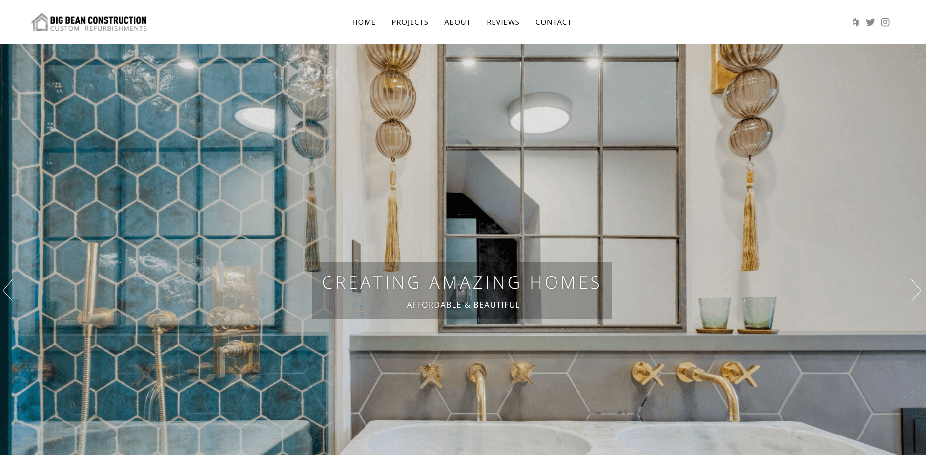
10. Big Bean Construction (Not a One Base media design)
big bean construction
Big Bean Construction are an award-winning, London-based construction company. We like the way the website showcases all of their awards and projects. A neat, tidy and uncluttered design.

9. Home concepts (Not a One Base media design)
home concepts
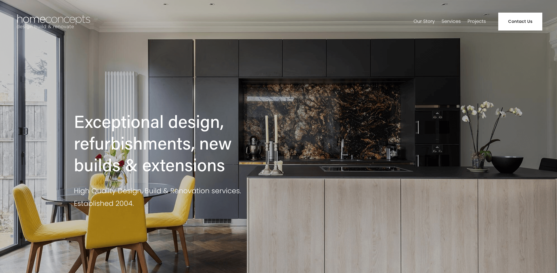
Home concepts are a building firm with a difference, established in 2004 and offering everything from design, planning and building. The website uses big, bold images, and we like the “our story” page, which details the company’s history.

8. Create Room (A One Base Media design)
create room
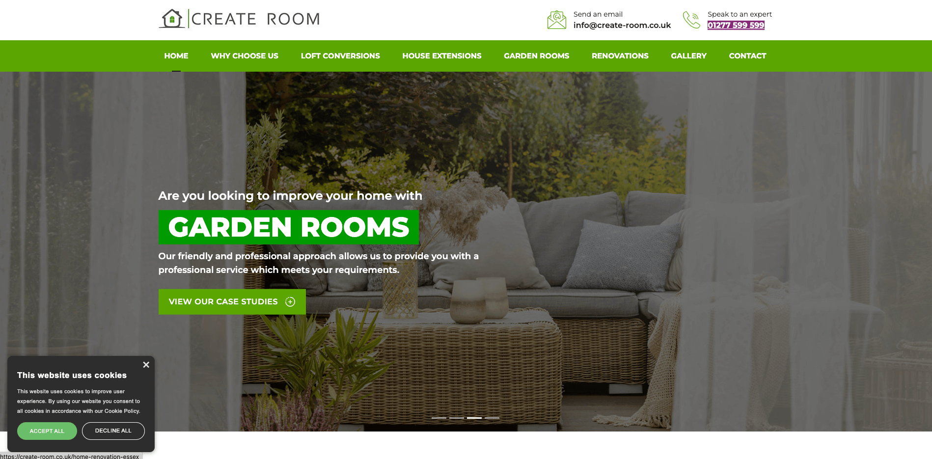
Create Room are a property extension and loft conversion expert in Essex. The website uses many images throughout and also goes into a lot of detail about every service they do, explaining the different types of loft conversions available. They also rank at the top of Google for very competitive keywords such as “loft conversions Essex”, generating many business leads.

7. Home Healers (Not a One Base Media design)
home healers construction
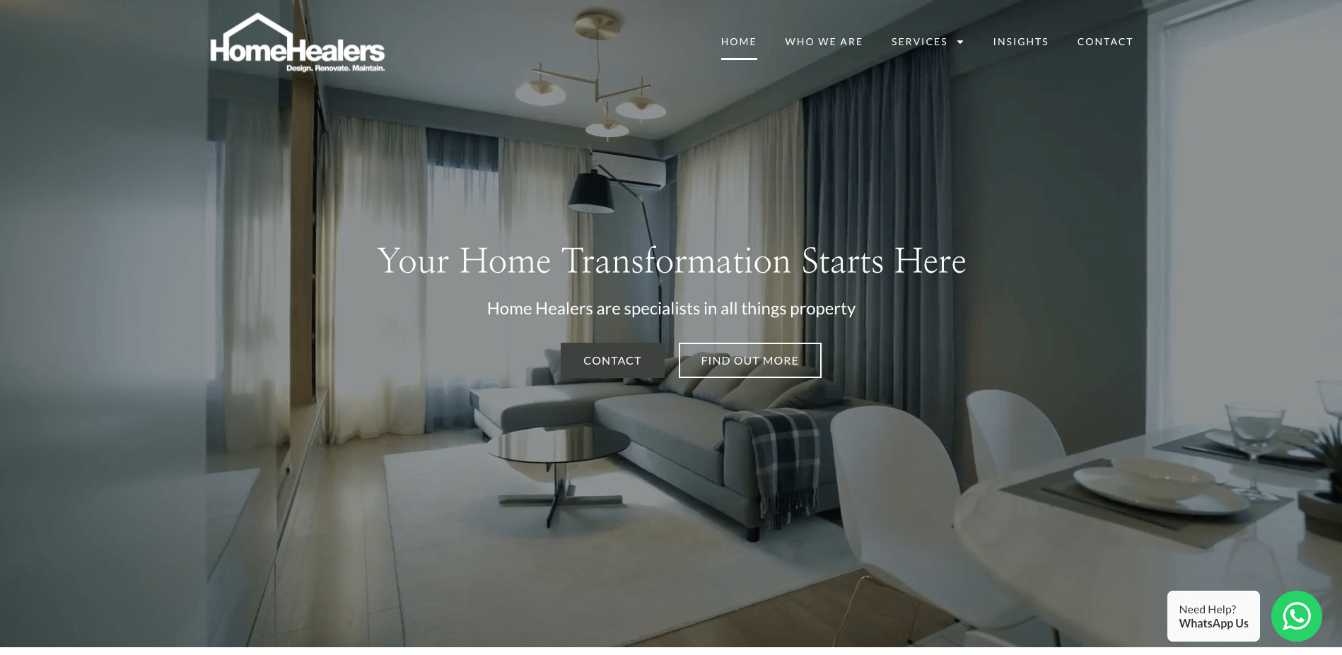
Home Healers specialise in everything home improvement. We like the home banner video that showcases a project they have completed. The banner also has simple calls to action, which leads the user to contact them or find out more about their services. We also like the WhatsApp button in the bottom corner of the website. This is a great way to get users to make an instant enquiry and speak to the company.

6. Costain (Not a One Base Media design)
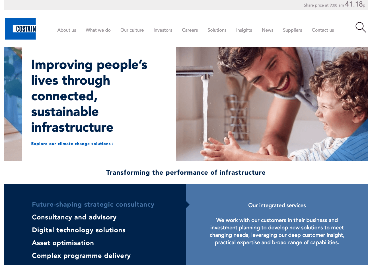
Costain has been improving people’s lives since 1865, with revolutionary services in the industry. The website has a lot of information about the services they provide, the projects they have completed, and a ton of industry insights.

5. Wilmott Dixon (Not a One Base Media design)
willmott dixon
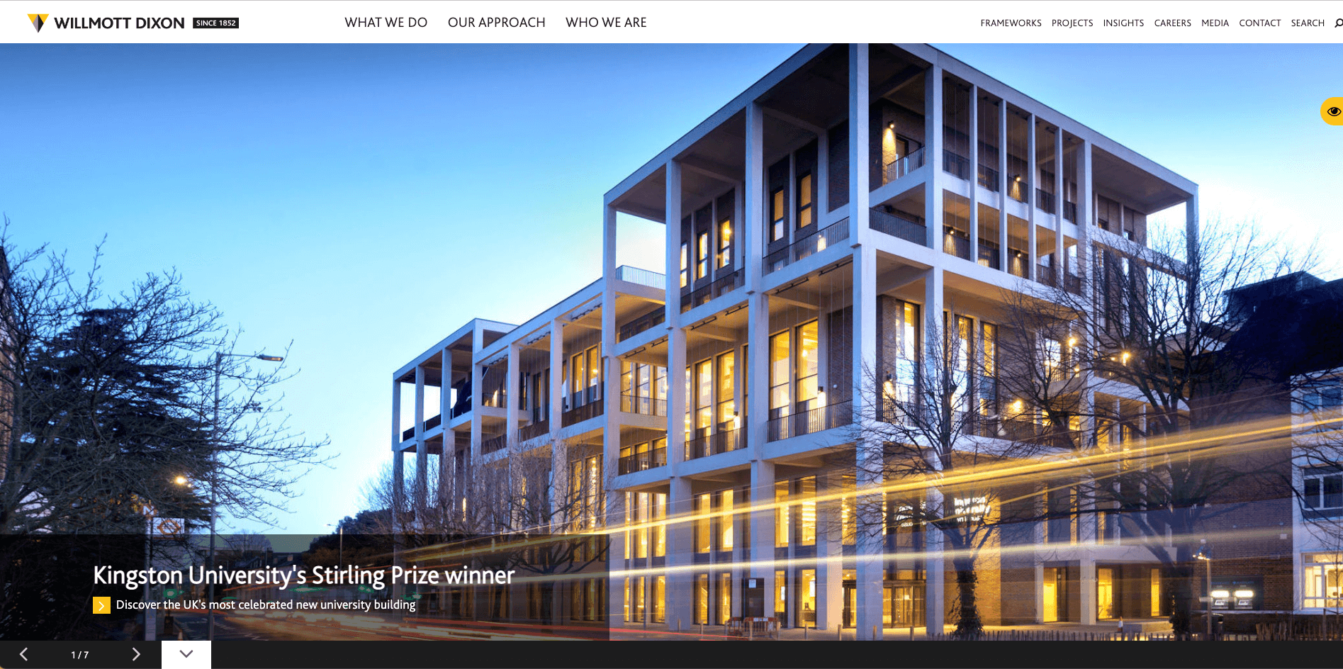
Wilmott Dixon has over 170 years of delivering fantastic construction projects. The website has a very modern and sleek design. With a tremendous amount of information on the website, it is still effortless to navigate and get the information you need.

4. Jackson Design & Remodelling (Not a One Base Media design)
jackson design
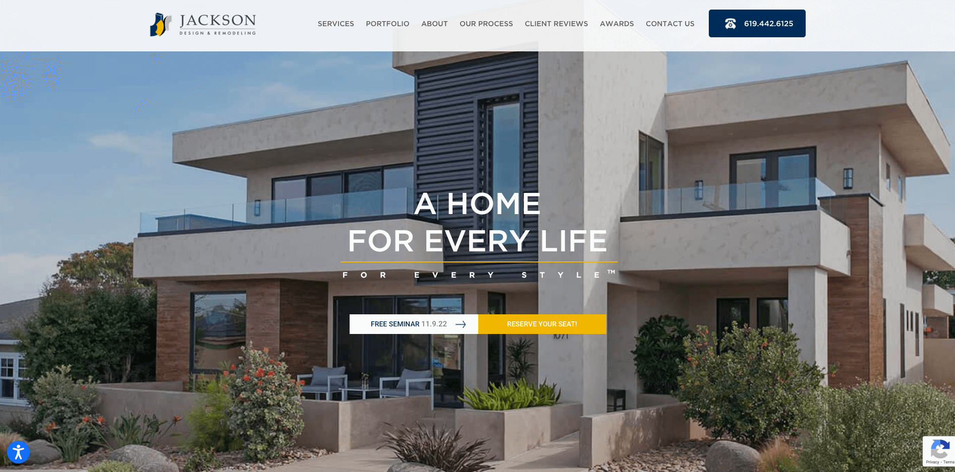
Since 1989 Jackson Design & Remodelling have built thousands of homes throughout San Diego, The website is easy to use and modern. We especially like the amount of information in the “about us” tab. You can read everything there is to know about the company. They also hold free seminars, which are visible on every page as a call to action.

3. Power Pillar (Not a One Base Media design)
power pillar
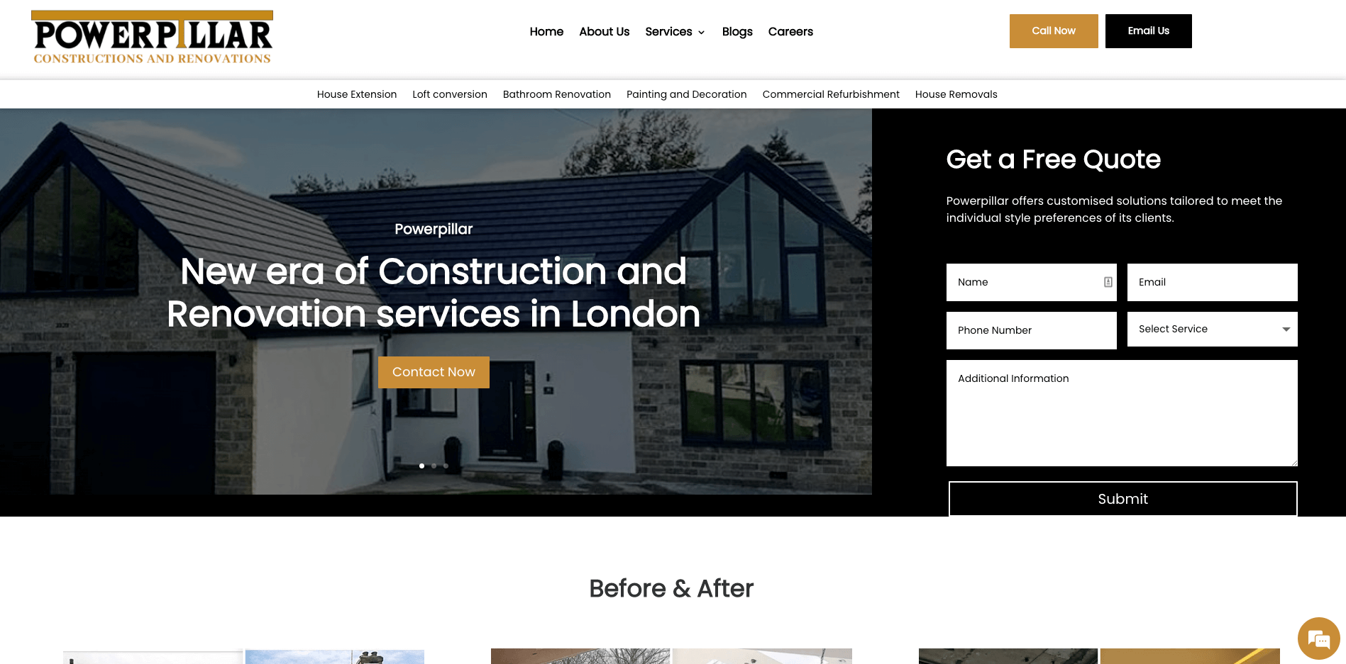
Power Pillar is a construction company based in London, offering everything from kitchen installations to commercial refurbishments. The website uses a very modern design and has some great images of the different projects they have worked on. We also like the way Instagram has been embedded to show the projects.

2. Denham (Not a One Base Media design)
denham
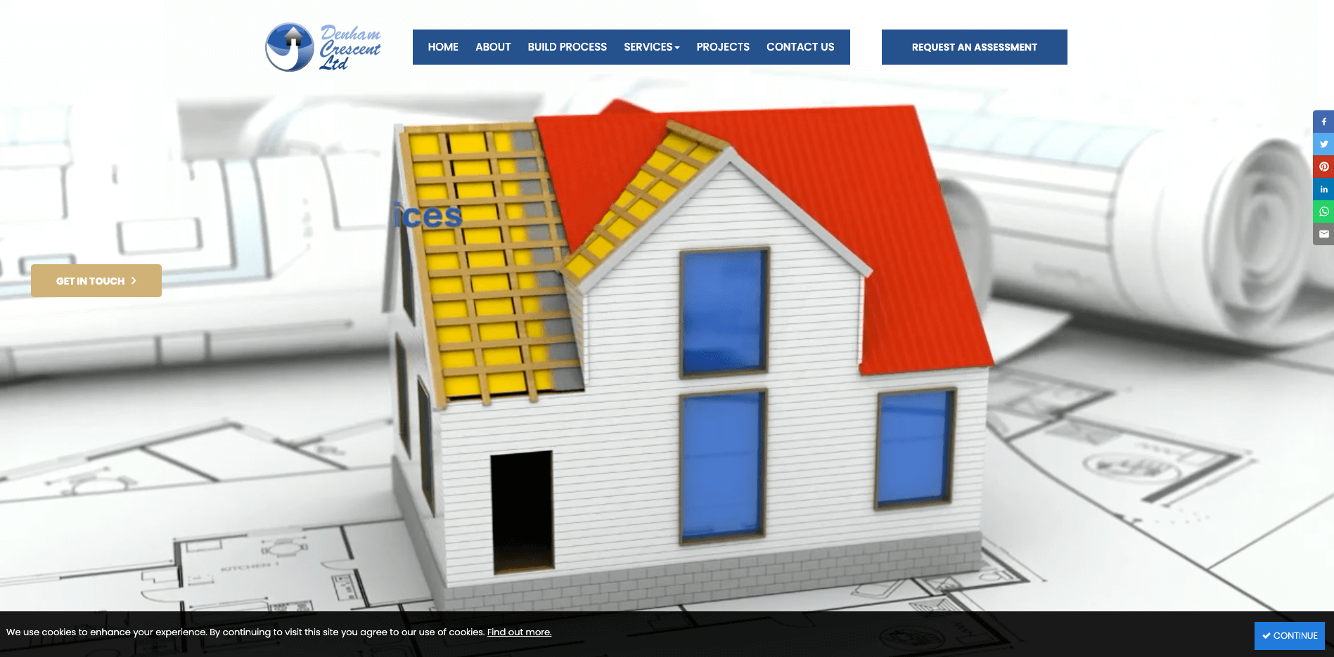
Denham is a London-based construction company offering services to the commercial and residential sectors. The website has a very subtle but effective video in the banner, and the use of hovers over images is very nice.

1. Mosaik Design & Remodeling (Not a One Base Media design)
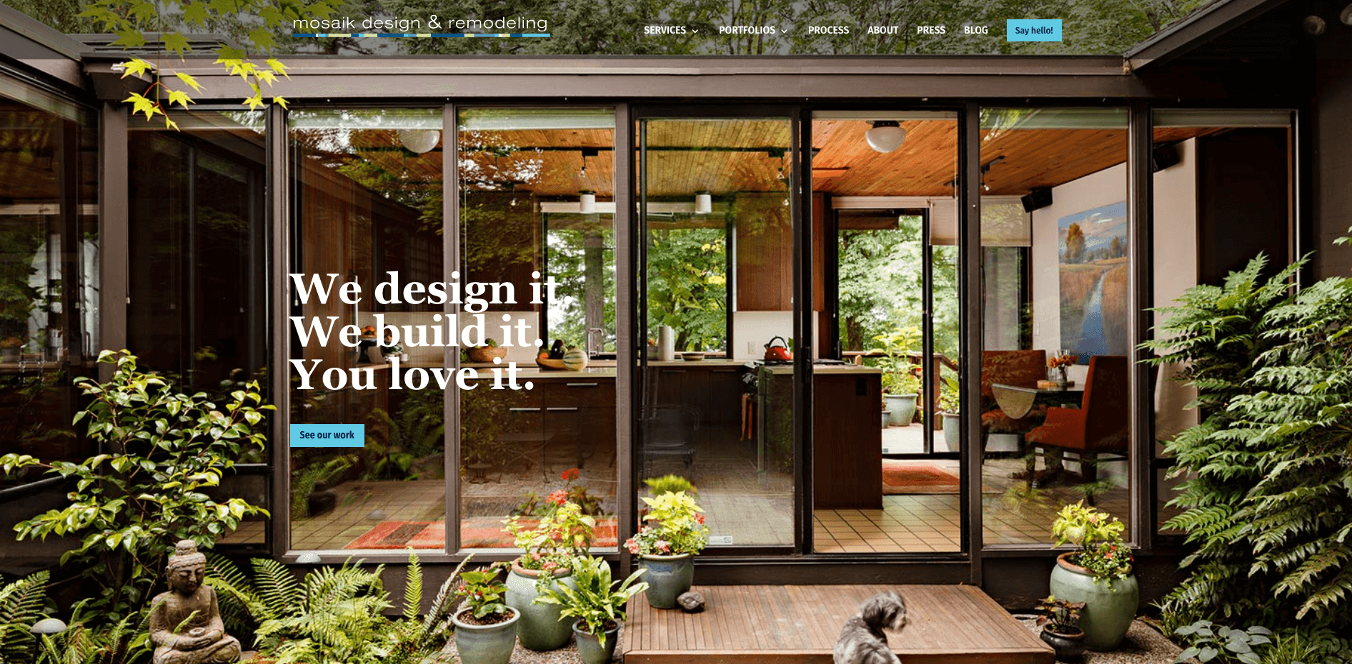
mosaik
Mosaik Design & Remodeling are a Portland-based construction company. We love the slogan in the banner, “We design it, We build it, You love it”. The website also has some quirky designs throughout, with some infographics. Overall it’s a very user-friendly website with some great calls to action.
Grace

Speak to a construction industry marketing expert

Got a quick question about your marketing. Or you want to run through the details of your next big project. We can help.

Speak to one of our experts today on 01702 668207 or send us a message.

Leave a Reply

Your email address will not be published. Required fields are marked *

Agency Owners & Freelancers
Fill your calendar with 80+ appointments each month from dream clients. 
Get instant access

    Reliable & predictable lead generation for trades

    Fill your diary with ready-to-buy customers every single week. GUARANTEED!

    • Send us images of your work, we do the rest
    • Leads only go to you
    • Fast and easy set up
    • Receive local leads by next week
    • If you don't get jobs, we don't get paid. As we work on a pay on results basis!

    Send us a message to get started

    OPT out from marketing
    secureYour information is 100% secure

    Archives

    Categories