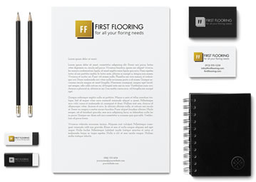
Designing an effective business letterhead is crucial for any business. Through a letterhead, you are representing your whole company and brand. As well as potentially being the very first point of contact from your company to a new customer.
As it is an extremely important matter achieving a professional letterhead, we are providing you with the top 10 pro tips to avoid making those devastating mistakes when designing your business letterheads.
Colour Overload
You may think that you are doing your letterhead justice, but little do you know that you might be overcrowding your design by adding too much colour it. You would want to avoid using extremely detailed graphics and gradients, as it could easily blind the message that you are trying to get through to the customer.
You need to keep in mind that your letterhead design also needs to look strong in black and white, due to the fact that your letterhead might be copied and faxed which is black and white only. Therefore making your letterhead complex and full of colour, may be an ugly downfall.
So what is the right amount of colour? We would recommend that the best way to maximise is to actually minimise. Stick to your brand colours, to maintain having all of your business elements familiar and to the same theme. As well as limiting to using only one colour can really make your letterhead design clean, simple and effective.
Irrelevant Information
What do you need to include in your letterhead, and what is irrelevant? One thing to remember is that you definitely do not need to include everything about your business in the letterhead.
We understand that you may have a lot of information and contact details, but you can go into detail when it is time to write the content of the letter. For now you will only want to include the important information, so that people can easily read the relevant details that they want to see. Critical information could include who it is that is writing the letter, as well as including an email address, return address, telephone and fax number if necessary.
Overcrowding
Overcrowding your letterhead can easily put off anyone. It is very easy to add too much information, which is why it is key to get the next steps correct.
The first step to success is to cut off any irrelevant information. Like we previously spoke about, there is no need to include everything and anything in your letterhead. You could easily make the design appear ugly, causing it to be too much of a struggle to read.
To fix this overcrowding problem leads us on to the next step for success, correcting the layout. A good idea before heading straight into creating your business letterhead design, is to plan out the layout. We recommend that you find or master up a template before you jump right in.
A big mistake is ignoring this step and rushing into making a complex layout and difficult to read letterhead. This way it ensures that you haven’t missed out any required elements and could cut down the information, process and of course your time.

Excess of Images
Connecting to the previous point, the use of too many images can easily overcrowd a letterhead within seconds. You should limit the quantity of images that you use, as well as reduce the size of the ones that you do decide to keep on your business letterhead design.
Wrong Font Style
You may overthink this stage, but it sure can have an influence on how effective your letterhead is at doing its job. There are hundreds, even thousands of fonts to choose from. But which font is the best to use? If you are not already associated with a font, you ideally want to go for the easiest font to read. Otherwise how would anyone be able to read it?
However, if your brand already has a font then the best idea would be to use that exact one to keep consistency throughout your brand. You should make it a rule that no more than two fonts shall be used.
No focal point
Ask yourself, do you have a focal point in your letterhead design?
Creating a focal point can really help improve the reader’s experience of your business letterhead. It means that your letterhead has elements that will guide the eye smoothly through it.
If you have a logo, this is likely to be your focal point. However, if you do not have a logo design, you can easily make your business name the focus of attention, or simply use design elements to draw the attention.
Bad Choice of Software
How will you be creating your letterhead? Do you have any helpful software to use?
This point is not necessarily a design mistake, but more of an inconvenience. There are numerous software that could make your journey a lot easier. For example Photoshop, Illustrator and InDesign. These tools have different roles and advantages to them, so choose wisely.
Illustrator and InDesign may be more suited to a letterhead, so it is really thinking about the features that can help you to make the best letterhead design possible.
Cheap Letterhead
Saving on costs may actually do more harm than good. Using cheaper paper or inks, can make your letterhead look tacky and cheap.
What do you have to look out for? If it is cheap paper, it may be too thin or can make the letterhead too rough. When it comes to inks, you can tell if it is cheap, due to the fact that it will be quicker to fade. This will not be the attractive letterhead that you will be proud of.
No Flexibility
You need to be flexible in today’s digital world. It is not guaranteed that a letterhead will be primarily used for printing. It is rather likely now that the letterhead could be transferred through email and all sorts of other media platforms. This means that you have to make sure that your letterhead design is adaptable.
Refusing Professional Help
Do you need an expert? It may be beneficial to get help from a professional in the field. If you do not have the strongest design skills, this could be the next step for you to take. A letterhead is extremely important to your brand and business, so you need to make sure that you get it right. Get an expert in who can make it perfect!


Do you mind if I quote a few of your posts as long as I provide credit and sources back to your weblog? My blog is in the very same niche as yours and my users would truly benefit from a lot of the information you present here. Please let me know if this alright with you. Thank you! ackekdeebcgk
Yes thats fine