

Social Media posting is important in any business, you want to make yourself present to your audience, however your design is also very important when it comes to Social Media posting. Your design shows you off as a business so you need to consider what you want your business to look like.
Below are 14 design tips to help with Social Media posting, no matter what type of business you have you should consider all these tips when creating something to show your audience on Social Media.
Use Contrast to Help Stand Out.
The best designs stand out! One of the best ways to do this is to use contrast, you can do this by using colours that contrast well.
So, for example if you choose a light background use a dark font colour, this contrast will help the overall design of the graphic stand out.
Choose your Font Palette.
Does your brand have a standard brand font? If so, stick to it as much as possible! Choosing a consistent font palette is a fantastic way of ensuring consistency and to help build brand familiarity with customers.
Try choosing a heading font, subtitle font and a body font, but also make sure they go together nicely. Choose a stand out font for the heading and a simpler complimentary font for the subtitles and body text.
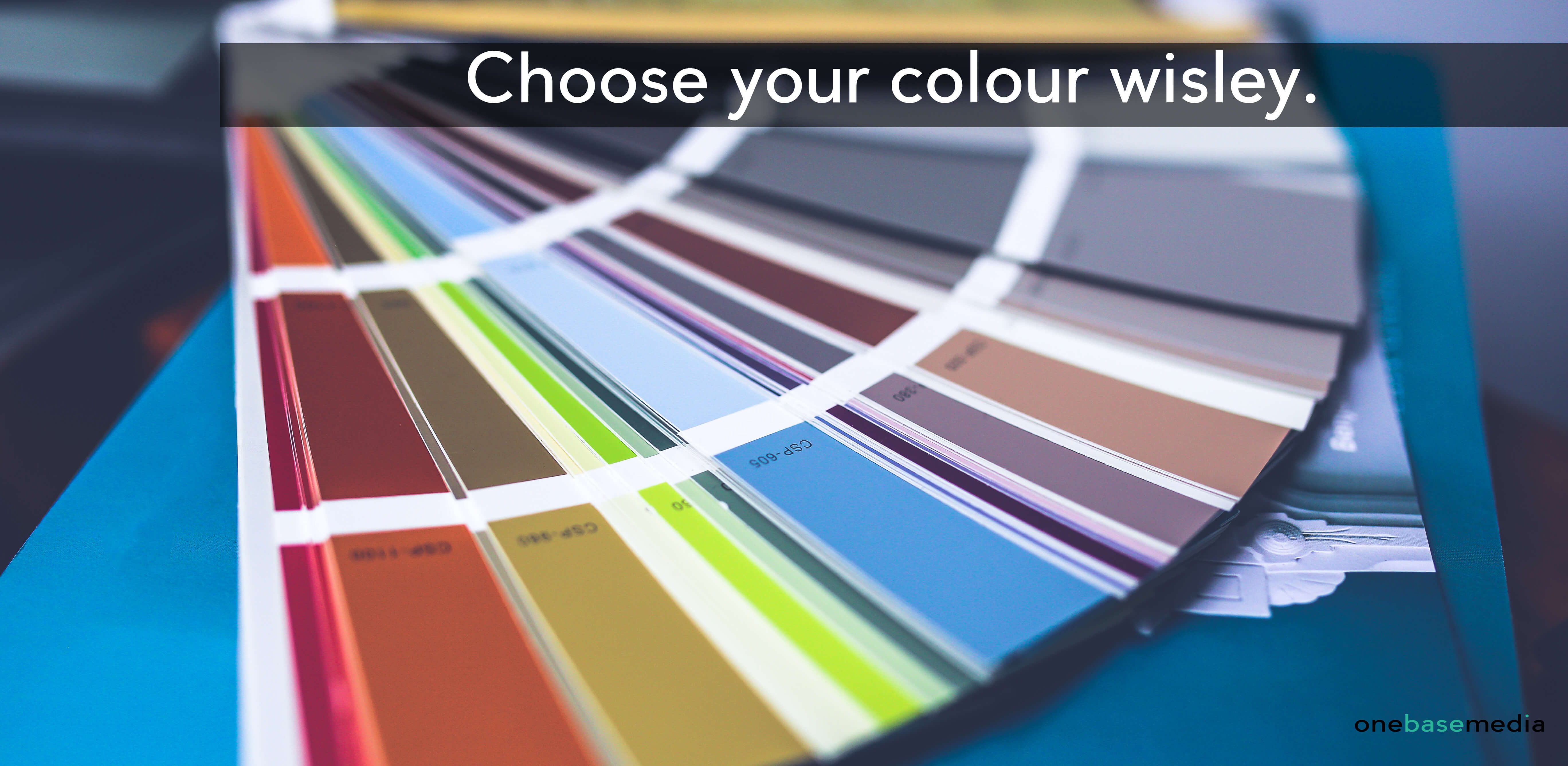
Pick a Colour Scheme.
Pick a colour scheme that reflects your brand personality. By doing this you keep consistency flowing and people will find it easier to associate those colours with your brand.
Start by choosing 2-3 main colours and build from there, make sure you use these colours continuously throughout your different graphics.
No Naked Images.
Images are a key part of graphics for social media! It is very simple to get a professional look from your images; you just use grids or frames where possible. Additionally, consider incorporating ai professional headshots for a polished and credible appearance. It adds order to your images, by using grids or frames to order your images the overall design will look professional and sleek in no time.
Keep it Simple.
It can be easy to get carried away with your design in terms of your images, graphics, fonts, etc. Simple is best when it comes to graphic design.
Reducing clutter means you are more likely to get your message across to your audience, so keep the number of fonts, colours and shapes to a minimum.
Use a Transparent Overlay.
This is a handy trick for when you want to use images in your background, but still want to use text within the graphics that are easily readable for the audience.
This is easily done in different editing programs such as; Photoshop, Post Designer, etc. by adding a square shape, filling it in with a block colour and changing to opacity to make it lighter.
Use Fun Icons to Reinforce your Message.
Vector icons are a great way to visually reinforce one of the words in your text.
They can add emotion to the graphic, such as; humour, this increases the emotional impact that the graphic will have, which is more likely to receive engagement on social media.
Let Shapes and Images Interact.
When you work with a program that allows for layers to be brought forward and pushed back, it is makes for a cool and interactive way of layering text over different shapes, banners, images, etc.
Alternatively, you could make the text interact with a background image by arranging it to fit around objects in the photo instead of just over laying the image.
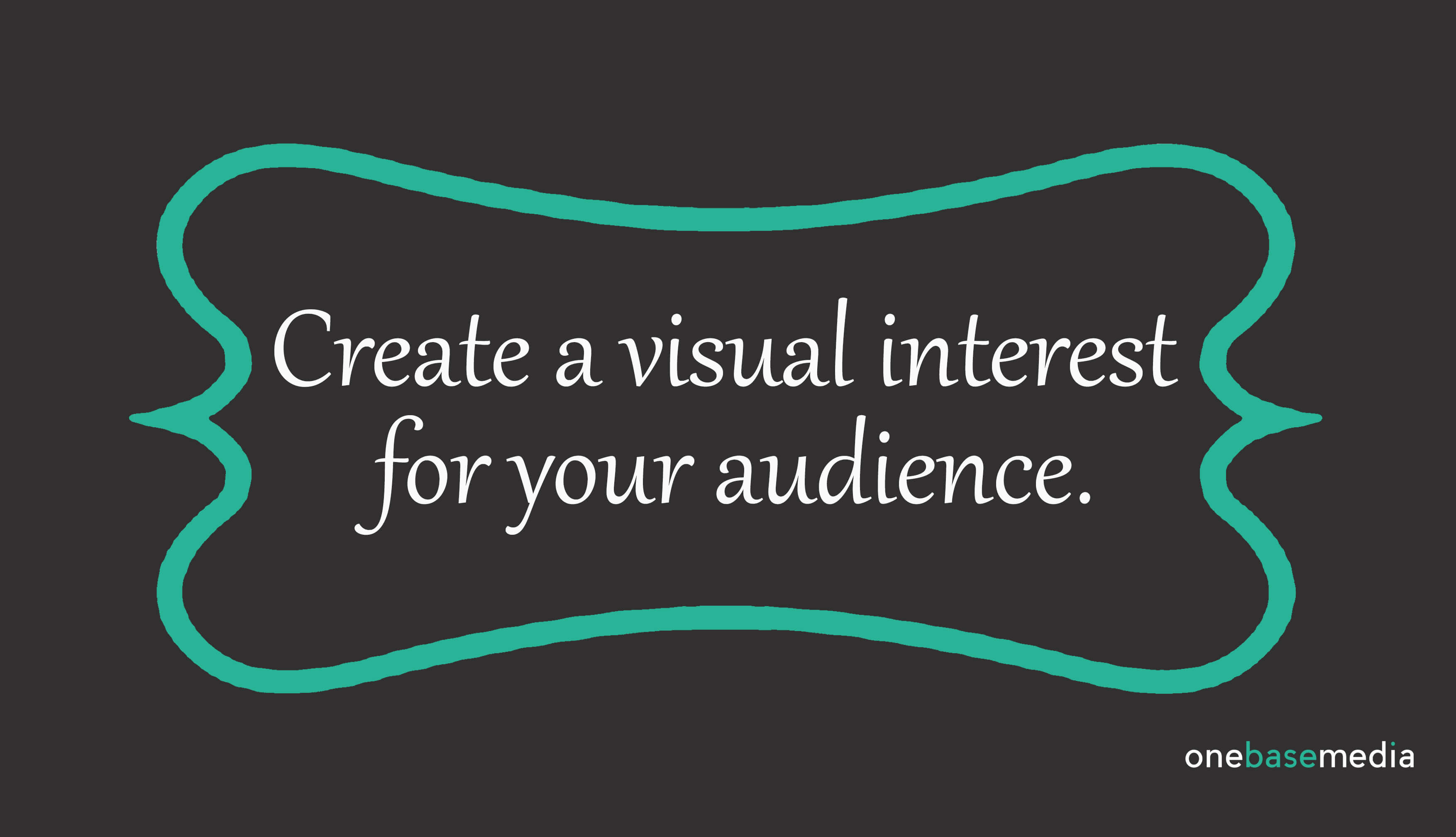
Use a Shape to Contain your Message.
If the program you are using allows you to resize shapes, try creating a large shape that you can fit your text into.
This will help set off the text from the background and create a visual interest for your audience. It will also draw your attention to what you are trying to get across in the graphic because the text is surrounded by something interesting.
Use Negative Space.
A design doesn’t have to be busy or colourful to be eye-catching. Sometimes using negative space (also known as whitespace) is an effective way to draw the eye to your text.
Never feel like you should fill all the space up, try a short message with one simple icon as a graphic, you will find that more attention it drawn to that graphic than one that is busy and full.
Setting a Mood with Colour.
As much as its important to have a colour scheme it’s also important to think about the mood/emotion that is associated with those colours as it will set a mood for your audience.
Here are a list of colours and their associated moods;
- Red: energy and Urgency
- Orange: Aggressive/Aggression
- Yellow: Optimistic and Youthful
- Green: Wealth and Relaxation
- Blue: Trust and Security
- Pink: Romantic and Feminine
- Black: Powerful and Sleek
- Purple: Soothing and Calm
Hierarchy.
Place the most important elements as the stand out elements within the graphics, make them bigger! Put your main message as the focal point, you don’t want that getting lost within the graphic!
Once you’ve created that you can focus on the other text that you want to add to the graphic without it taking away from the main message.
Use High Quality Images.
Remember the quality of graphics you put on social media reflects your brand. So, it will pay off going to get quality stock images or utilize AI to create images.
This is because quality imagery grabs the audience’s attention and will also boost your brands credibility and professionalism.
You can get quality stock images from stock websites such as;
Tap into Trends.
One way to tap into current trends is to do some research specifically on Pinterest, as its always a platform that is being updated with trends that businesses could be posting around.
But remember you should never copy other people’s content, however creating your own unique content that links to a specific trend is an effective way of grabbing your audience’s attention.